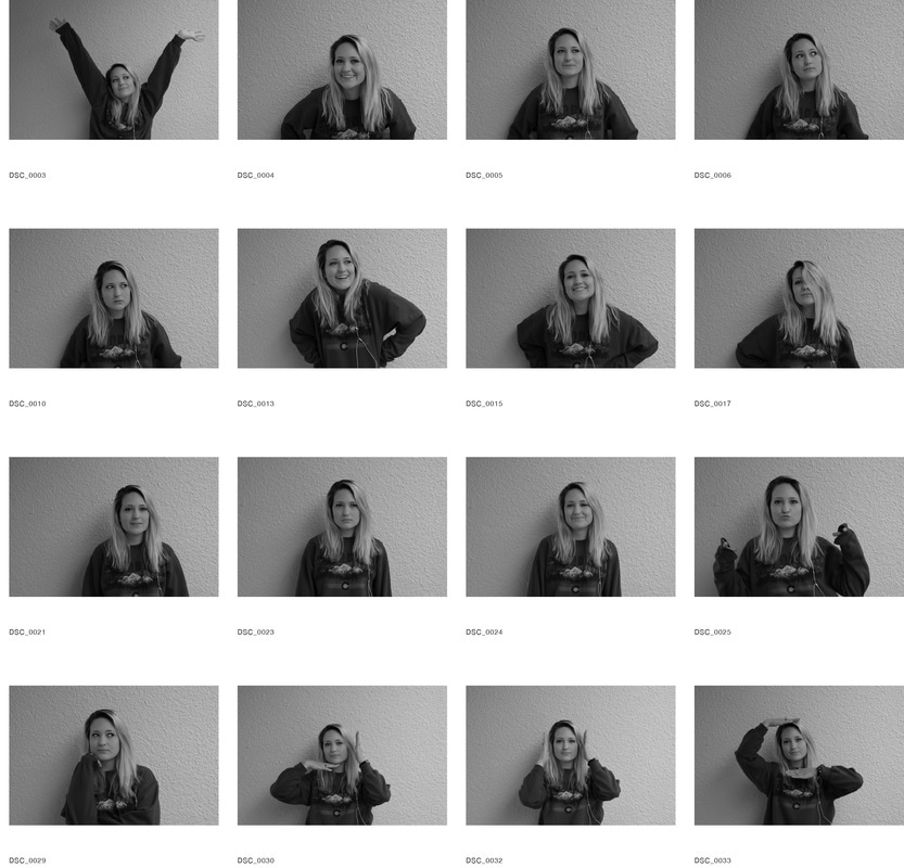
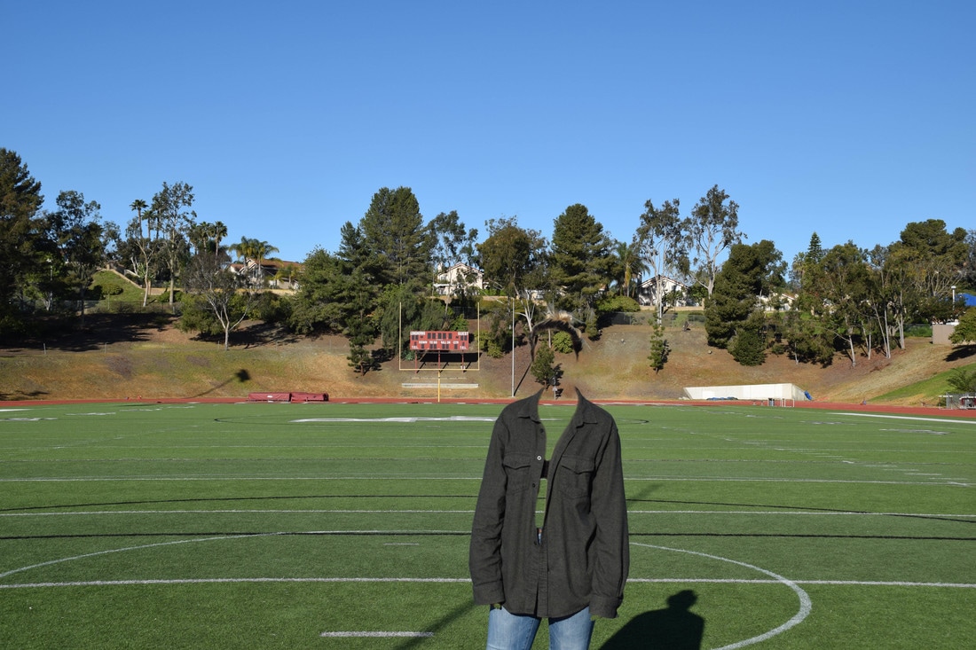
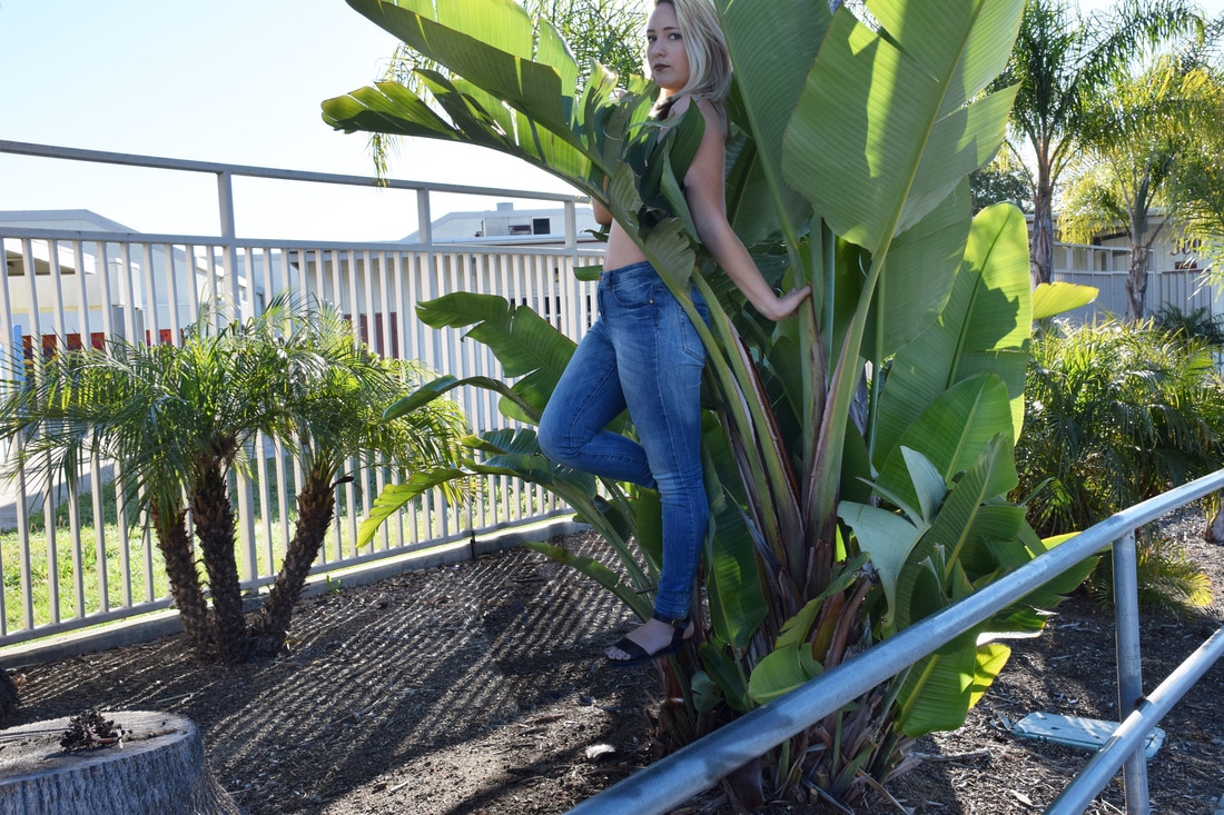
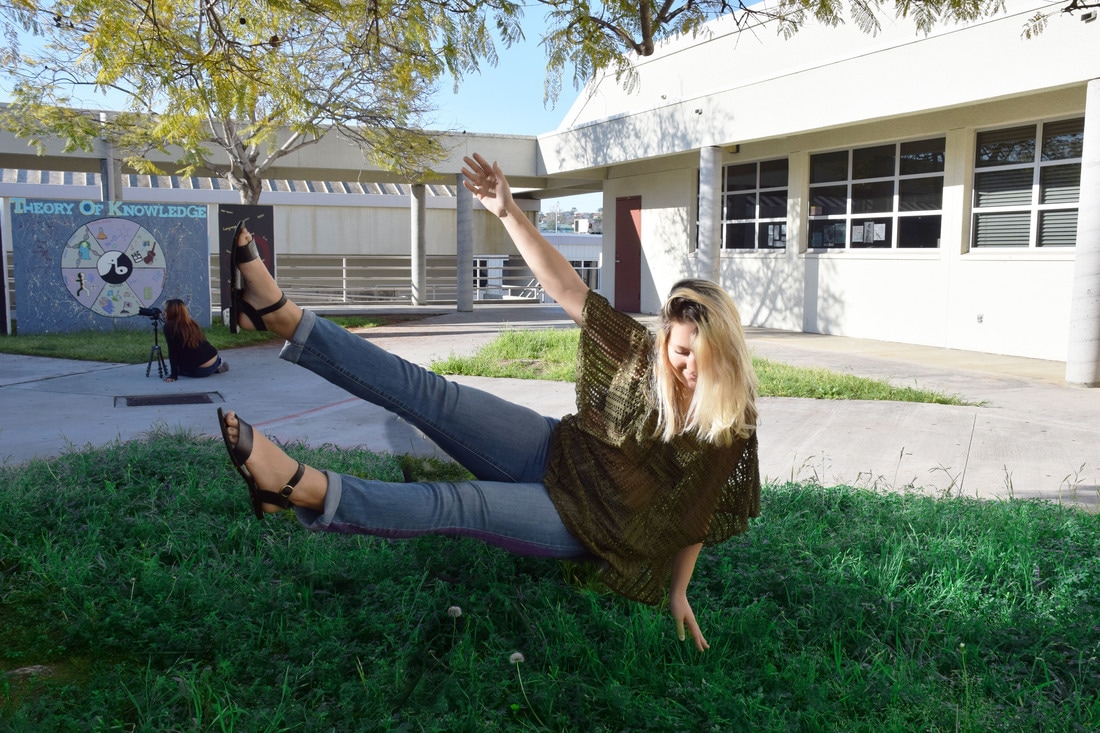
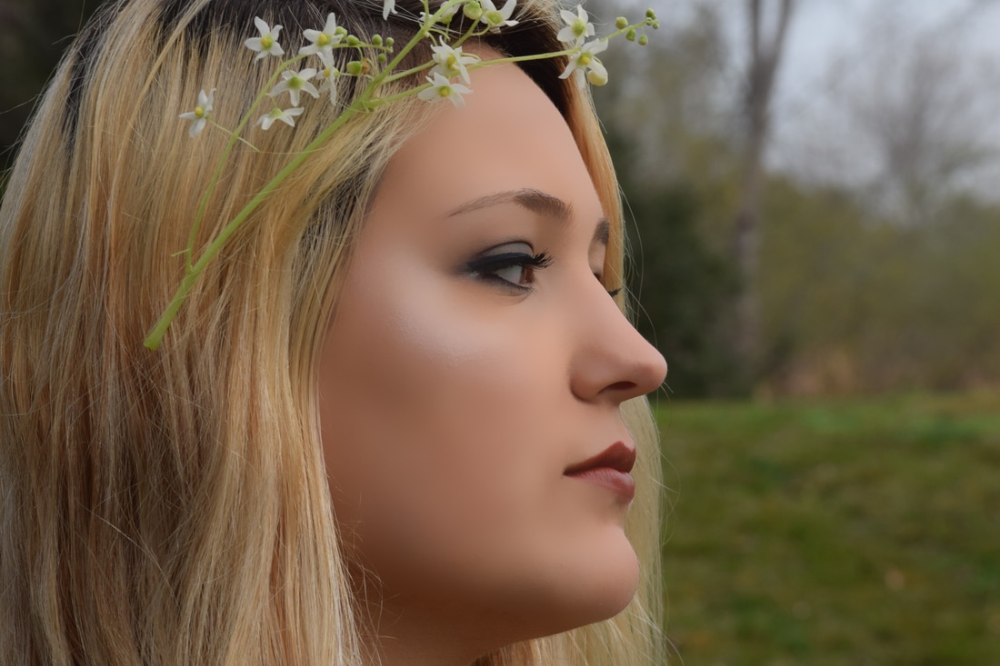
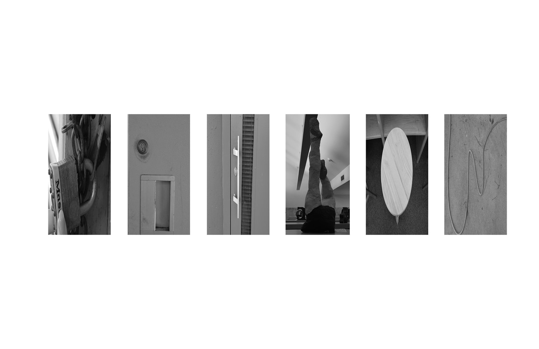
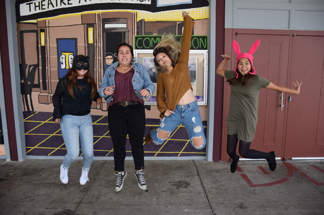
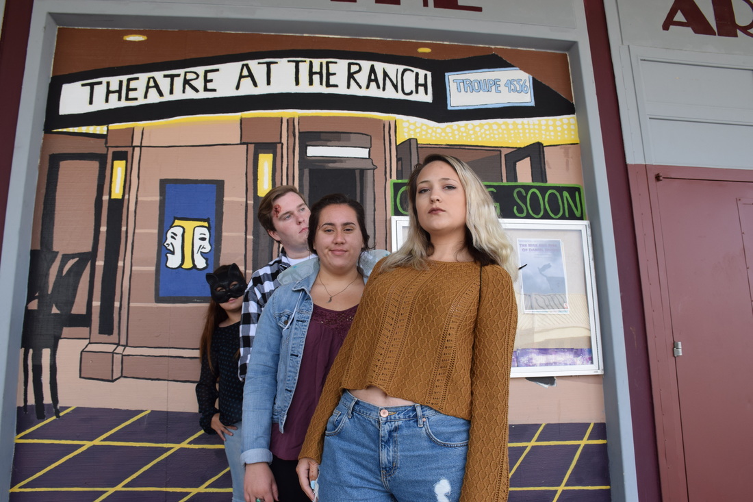
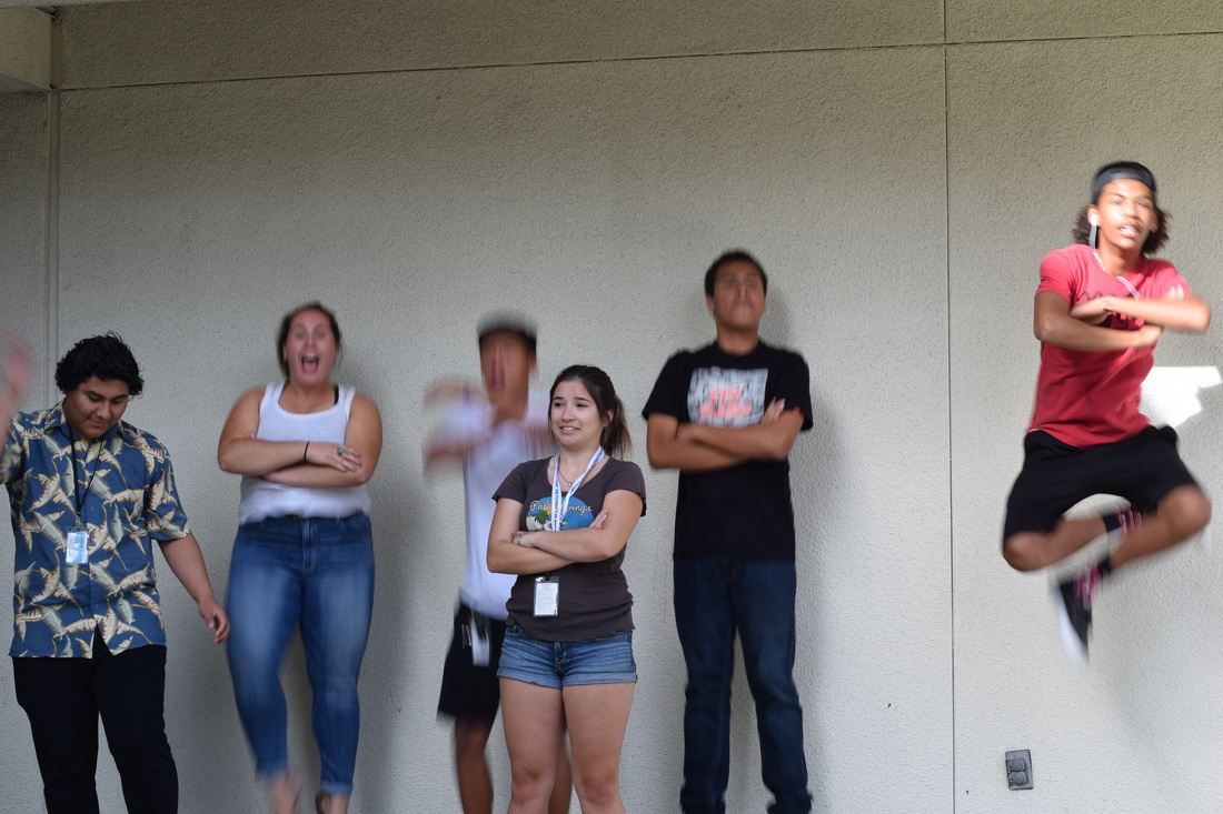
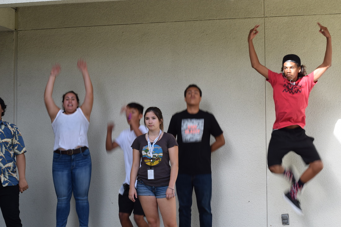
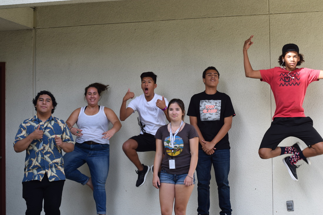
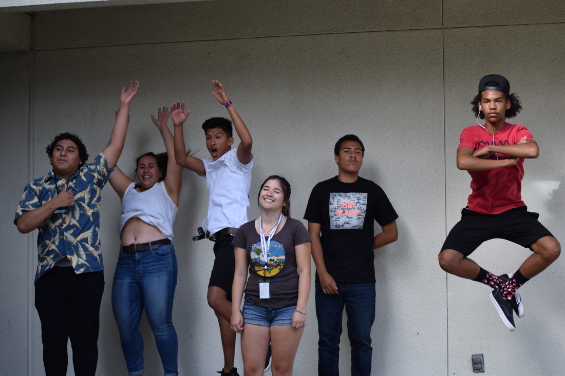
Hockney Inspiration
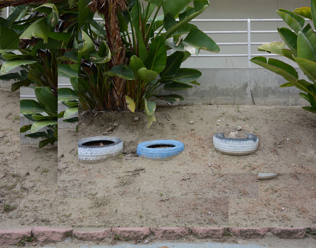
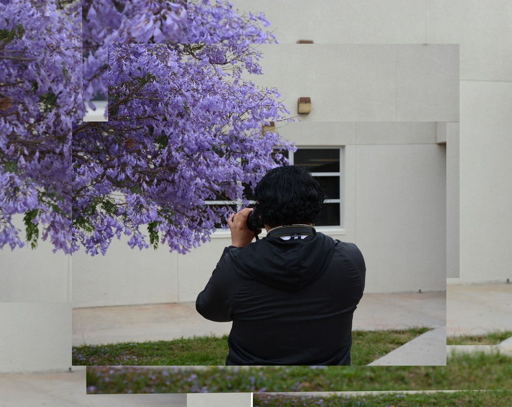
David Hockney is an English painter, draughtsman, printmaker, stage designer and photographer. His work is known for its abstract style and look. He is known as an important contributor to the pop art movement of the 1960s, he is considered one of the most influential British artists of the 20th century. Hockney has a home and studio in Kensington, London and two residences in California, where he has lived on and off for over 30 years.
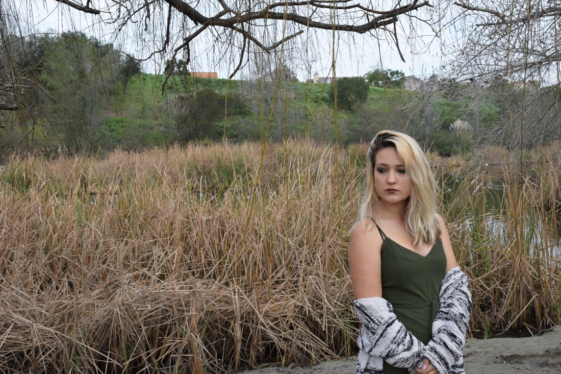
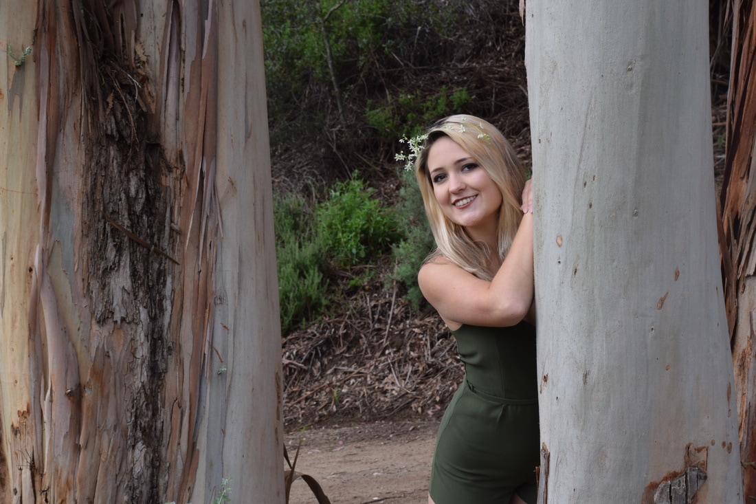
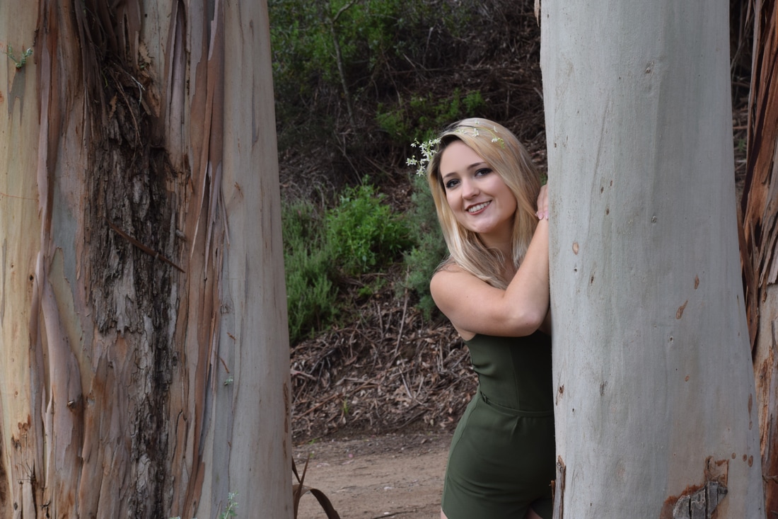
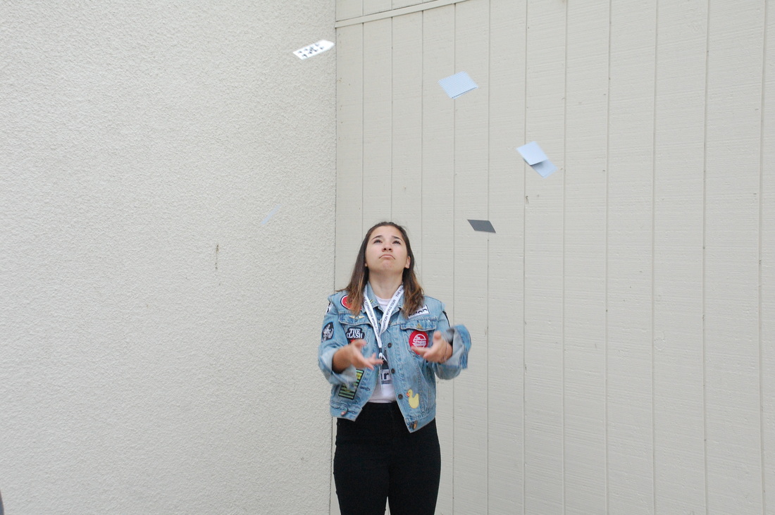
For my Hockney recreations, I was struggling. My first photos were stationary so when I collaged them, the photos didn't merge well. When I retook them, I included various angles so they can be connected but still have a clear center subject. How I made these photos was by making a blank white page on photoshop. From there, I added multiple pics (overlapping) and merged them together. After this, I adjusted different pics lighting and shadows for some contrast. My favorite part of this project was getting to learn a new style technique for editing photographs.
For my Hockney recreations, I was struggling. My first photos were stationary so when I collaged them, the photos didn't merge well. When I retook them, I included various angles so they can be connected but still have a clear center subject. How I made these photos was by making a blank white page on photoshop. From there, I added multiple pics (overlapping) and merged them together. After this, I adjusted different pics lighting and shadows for some contrast. My favorite part of this project was getting to learn a new style technique for editing photographs.
Light Room
Magazine Cover
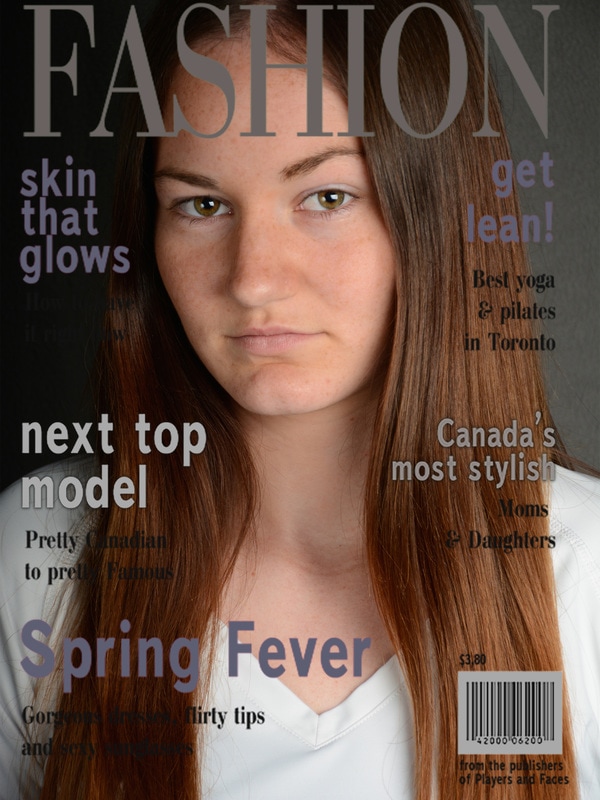
At first, my photo was of Kim standing but the pose didn't fit the magazine style. This is when I chose a portrait that looked more like a magazine photo and had a nice clear look to it. I had her tilt her head slightly and give a soft smile. After I had this photo ready, I softened up the skin to match the "skin that glows" article and adjusted the lighting to get the most vivid head shots that replicate model shoots. The original color was lime green and neon pink fonts but I changed them into more neutral colors that you'd most likely see in a real store.
For set up we had Kim stand directly under the model lighting while another partner held a reflector. This is a huge gold wheel that reflects certain light in areas you point it towards. We also had big lamp like stand that is called strobe lights which create the flashes before snapping a photo. Mixing these elements with the strobe light's flash and soft box ( a white box that reflects and bounces light back off it) led to the shades in the background and clear bright portrait in the center. Before taking the photo, Kim had to hold up a grey card. This is a card that has three lines of grey and is used to show us if the shadows matched the shades of grey on the middle line of the card.
Once this was accurate and matching, the lighting display was set up for the perfect shot under the model lighting. I was struggling with getting even photos because of the way the light was placed. My first photos were uncentered and needed to be adjusted. Once I had a clear and centered position I just had Kim be natural and pose. If I had to do this again I would choose a more popular magazine and figure out a way to get the template separated.
For the Family photography I wanted to capture the fun and unexpected moments. The photos I ended up choosing had humor and happened naturally. Working with kids can be hard because the way they can move but these moments happened in a photogenic way. I would have taken more photos if I had to do this a second time but overall like my final products. The aperture was f/5.6 and the ISO was 400 for all photos.
For the sports photography, we played soccer, volleyball and did gymnastics to get action shots. I chose the photos because they are in the moment and have some humor to them. If I had to do this again I would have taken photos of more wider groups interacting instead of small groups so the movement is more diverse and unique. All photos were taken on f/5.6 and ISO 400.
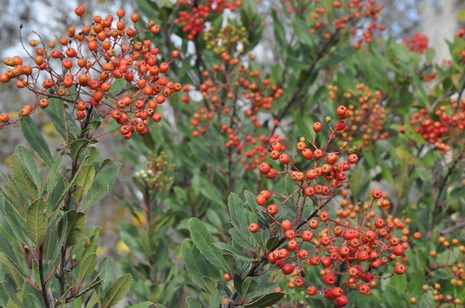
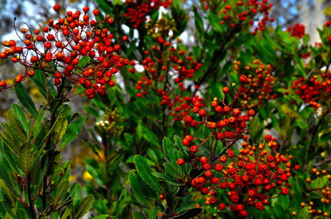
Del Mar Fair
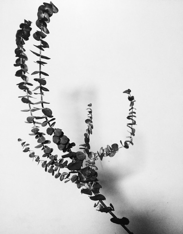
My photo is titled A White Spring because of the bright white background contrasting the grainy shadows of the flower. It was taken in my home utilizing a white backdrop and unique plant. I added the black and white filter because it gave off a very old fashioned vibe mixed with a simplistic subject. I used a basic edit feature on the Picsart Application to do so. My inspiration was Aaron Siskind through a emphasized center and plain surrounding. I felt that this gave my picture a straightforward effect that encompassed the old-fashioned style many early photographs had.
Mood Portraiture
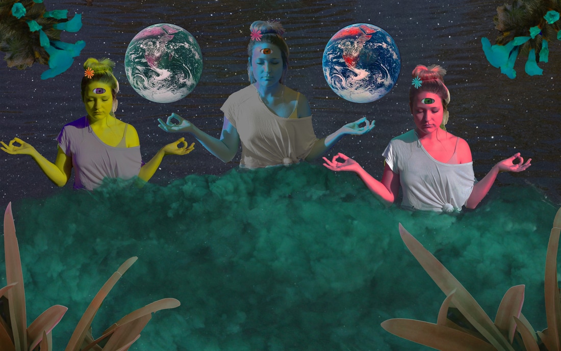
For my photoshop process I started with the lake photo. Then I added Tori by cutting and pasting her into the photo so that I could fade out her legs to look like she was in the water. After doing this three time I placed her in the spots I wanted and changer her skin tone ( each time a new color). After this, I faded a starry sky into the back so it would have a space theme. From there I added in multiple layers of the green clouds/smoke and faded it into the bodies. After, I placed the details such as the flowers in her hair and the plants around the border. My goal was to imitate Ben Von Wong's use of vibrant color but also add my style and flavor. My lyric inspiring this composite photo was taken from the poem The Old Astronomer to his Pupil by Sarah Williams. The line is... "for I have loved the stars too fondly to be fearful of the night". I took this as the astronomer accepting his death and journey into the universe because it has been his passion and life's work.
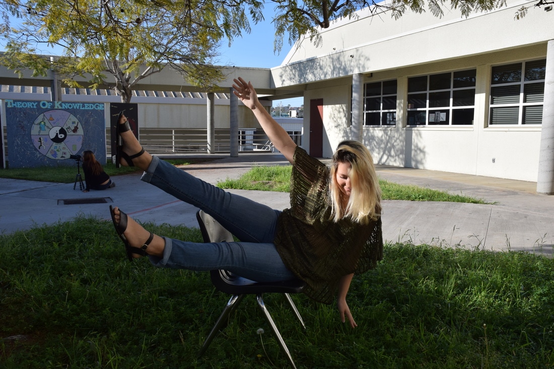
Float/Invisible Photography
|
|
|
|
The steps I took to make my partner invisible included making two layers (one with her in the pic and the other of just the background). Once combined, I was able to erase any skin and make it appear see through. This applies to the floating as well but only had the chair be erased instead of her body. Once this was done I made adjustments to colors and brightness to look better in quality. If I would have done this again I would have experimented with different angles and perspectives as well as cool poses for the invisible photos. I like the invisible photos best because the concept is cool and the front view photo came out very interesting.
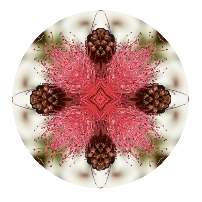
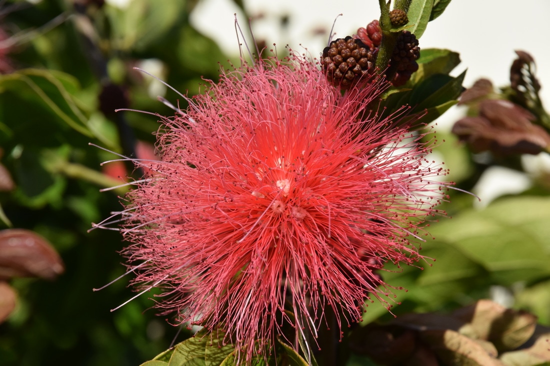
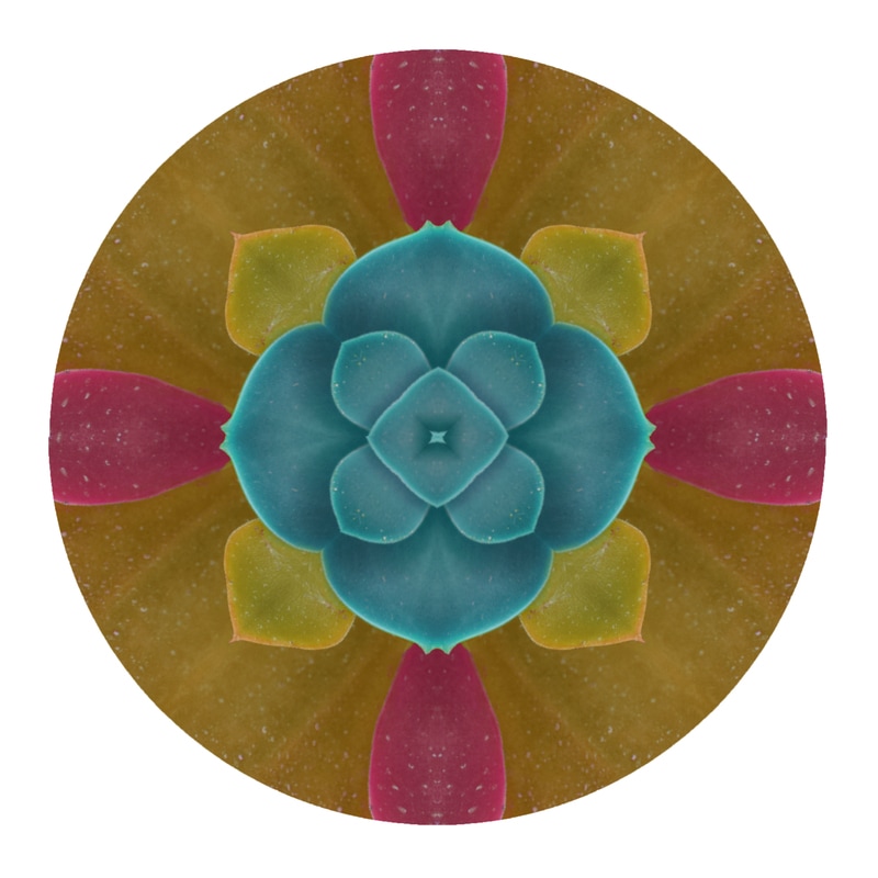
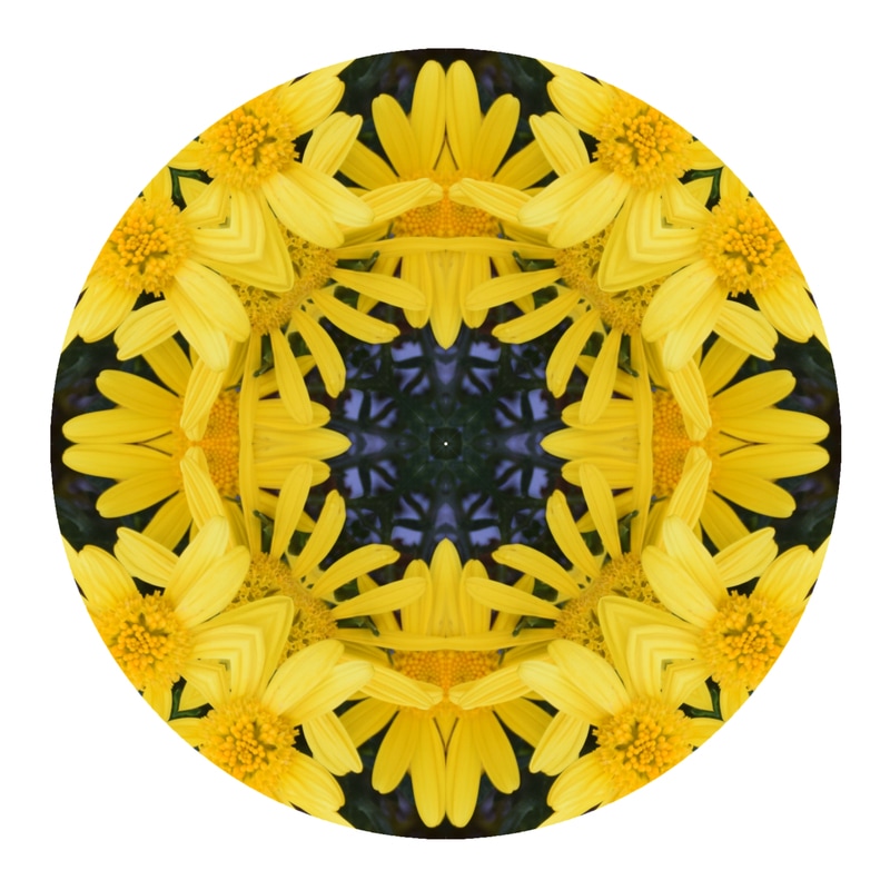
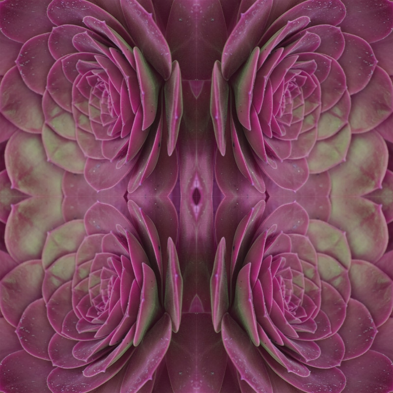
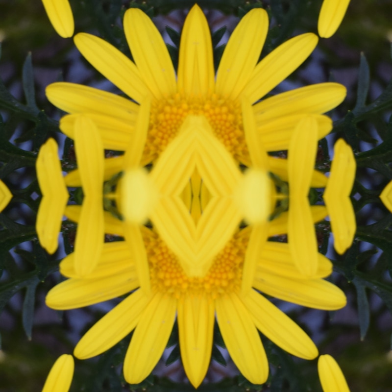
Mandala
For my mandalas I opened up the template through photoshop. I took a section and outlined what part of the photos I wanted and then used the copy and paste keys to drag it to the template. From their I had to rotate the pieces and make sure no space is being created. The hardest part was having to decide if the section needs to rotate horizontal, vertical, 90 degrees, etc. After it is all together in the circle shape, I took away the template and saved the final piece. My favorite one is the flower mandala because it looks like a CD cover and I really like the vibrant yellow contrasting the deep purple in the back. If I had to do this again I would have chosen photos with more detail so the design looks intricate.

Tessellations
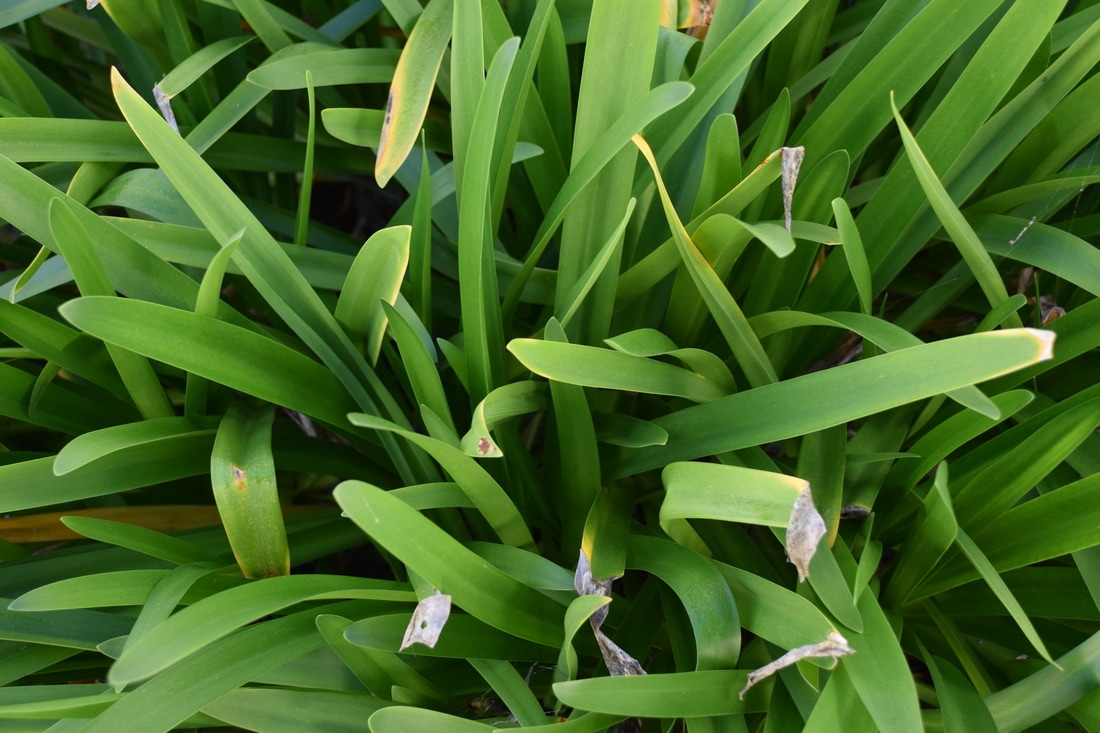
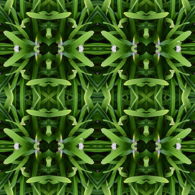
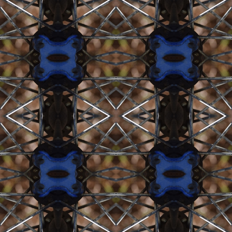
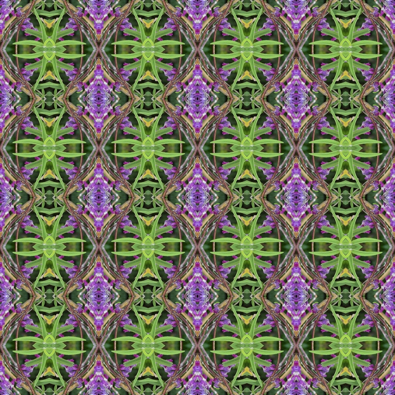
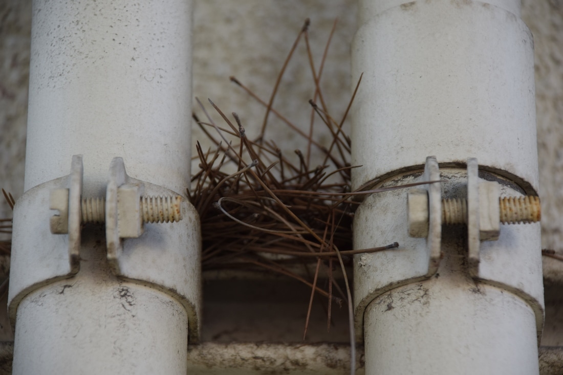
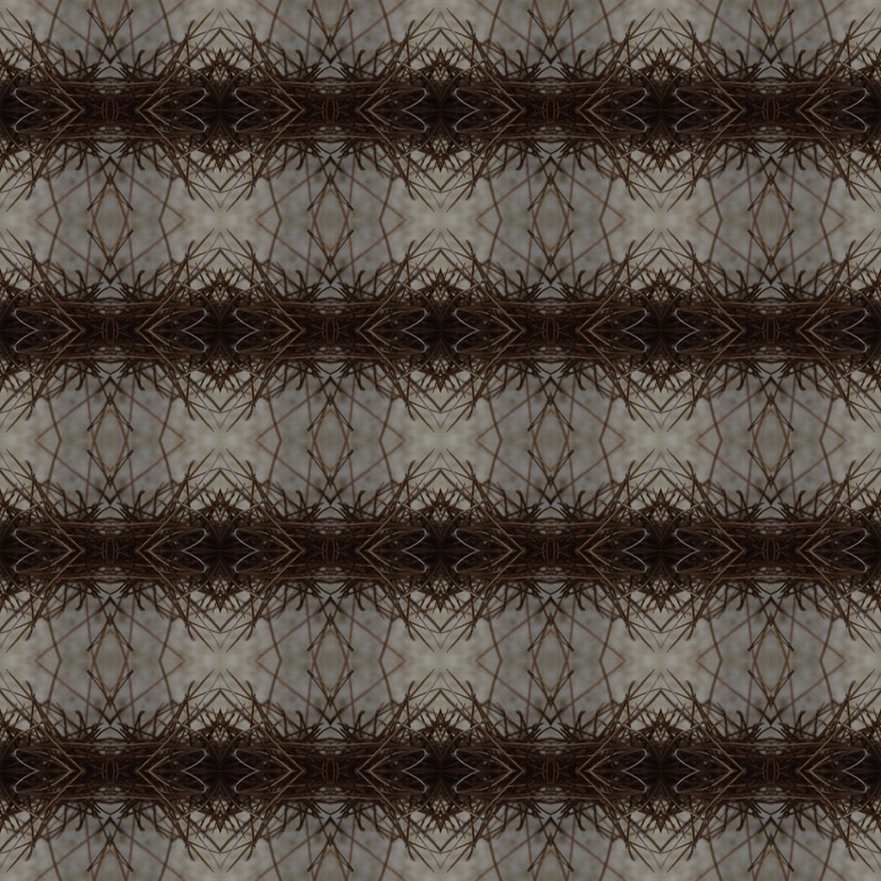
To make my tessellations I opened up the specific sized templates in photoshop. From there, I opened up the photo I chose and cropped out a section. From here I refined the edges and sent it to a new layer with layer mask. This is where the section appeared on the template and I was able to duplicate them and rotate it to look right. My favorite one that came out is the twig one because an unexpected shape formed from random section. The process was easy overall but It took me a while for me to make sure no white lines run across the photo. If I had to do this project again I would have taken photos with more contrast in color and shape.
Portraiture
|

|
|
The editing was a bit hard because my partner had makeup on which covered majority of flaws. Also she is farther from the camera so change is a bit unnoticeable unless you zoom. Aside from that, the steps I took to edit the photos were as follows...First I used the outline tool to draw over Tori's face. Then, I selected the option to refine the Image where I was able to import it to a new layer and began retouching. This included blurring skin and choosing different saturations of her face to give it that extra glow. As for the poses, I feel they had a gothic feel and the poses were supposed to be minimal but blend with the surroundings. The reflector was not able to be used because the lighting was minimal and the clouds stayed for the whole picture taking process.
Name Project
For this project there were many steps. I had to individually turn my photos black and white in iPhoto before beginning. Then, through the template on our class drive, I was able to import each photo and place them on each box. I was struggling with sizing at first and realized that I needed to crop and resize some photos until they looked normal in the collage. I was most proud in being able to independently finish this project through the steps on the web and my basic photoshop skills.
Law Firm Contest Entry "Education for All"
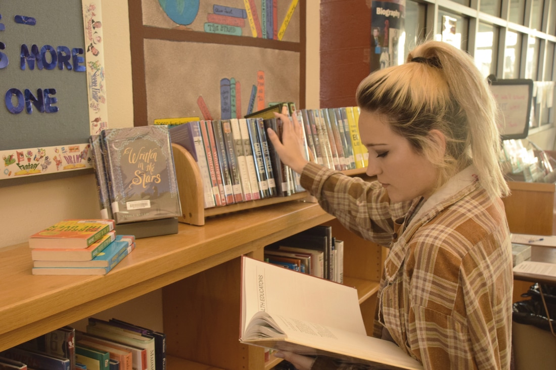
A community united in education can move any mountain and shatter any obstacle. This evolving concept of shared education is a right that every person should hold accessible to. It is a value earned through knowledge and growth as a person. With the gaining of knowledge, in a community, comes the thriving bonds many individuals can make. Social justice and educational endeavors can be made to improve one's quality of life. Other people can strive to gain more information on what they see right and join others who share the same point of view. Education for all is the essence of drive and encouragement in self teaching and information seeking. My photo captures a student wanting to discover her passion through the various tools available to everyone. She takes advantage of the public display to develop her interests. This is truly the knowledge thirsty individual many of us strive to be. Education, as a whole, is a concept that will remain open to those who desire it most.
Bowl of Fruit
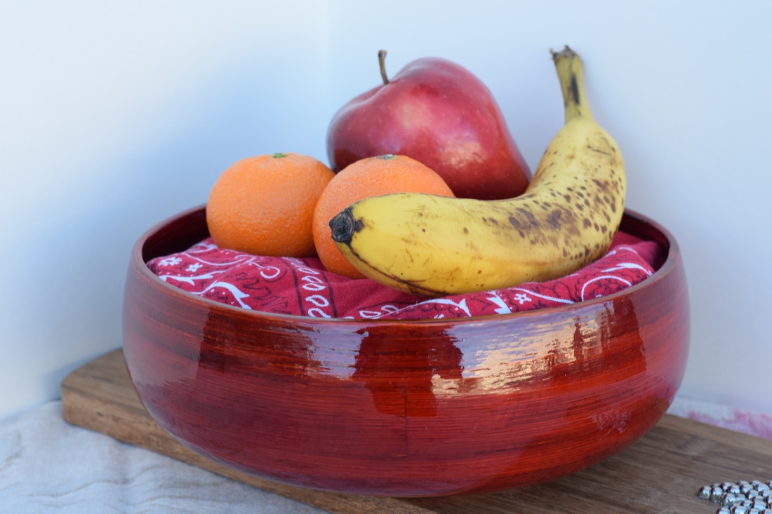
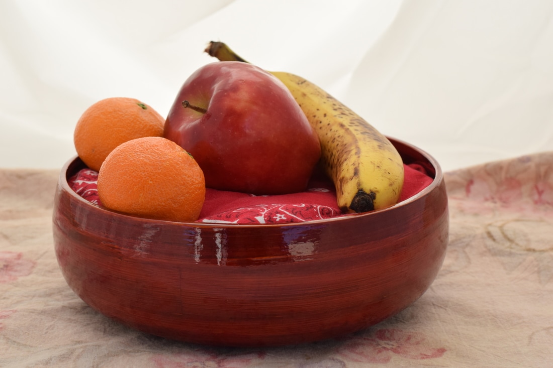
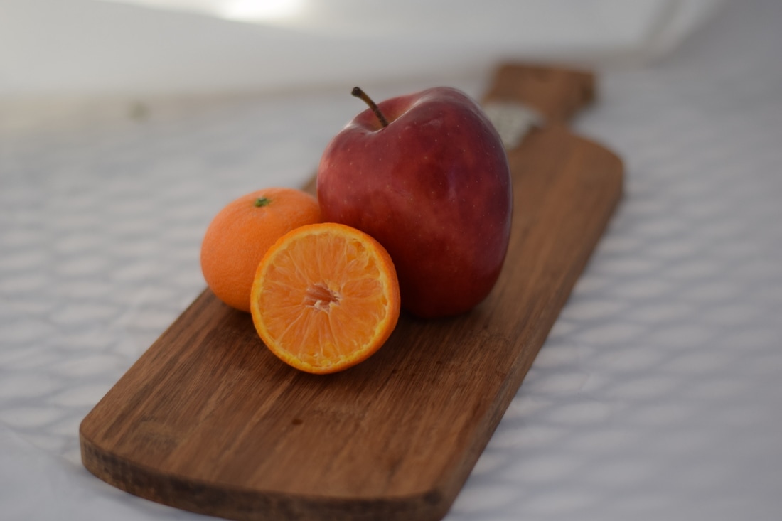
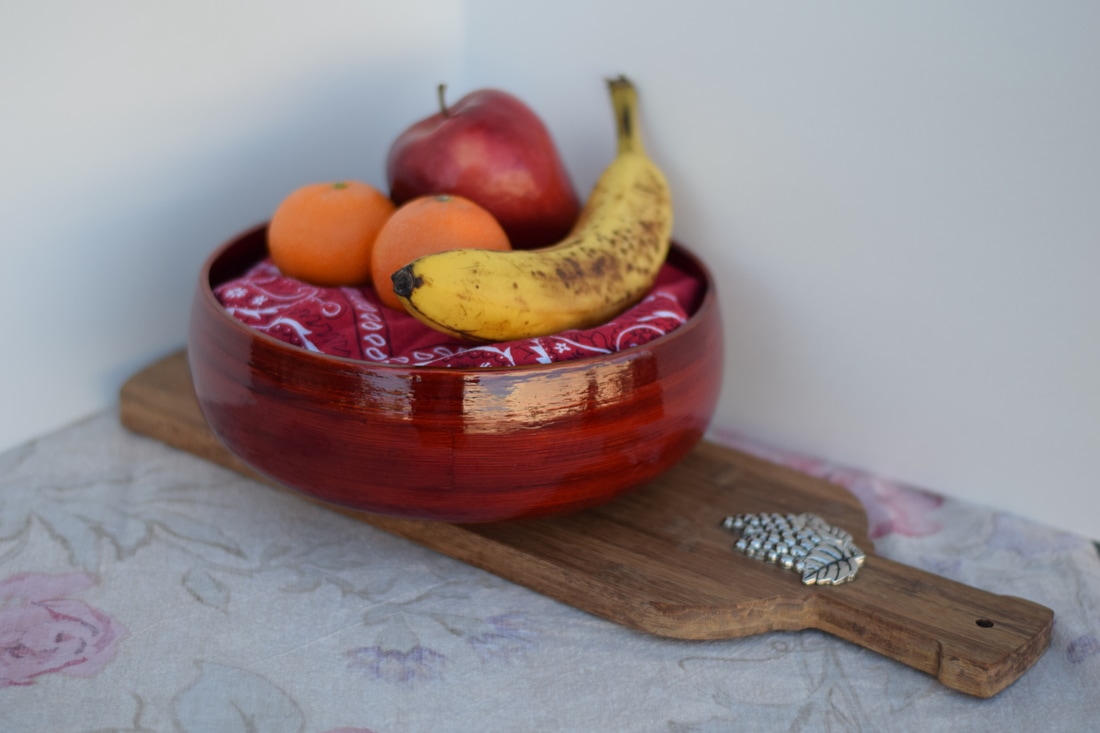
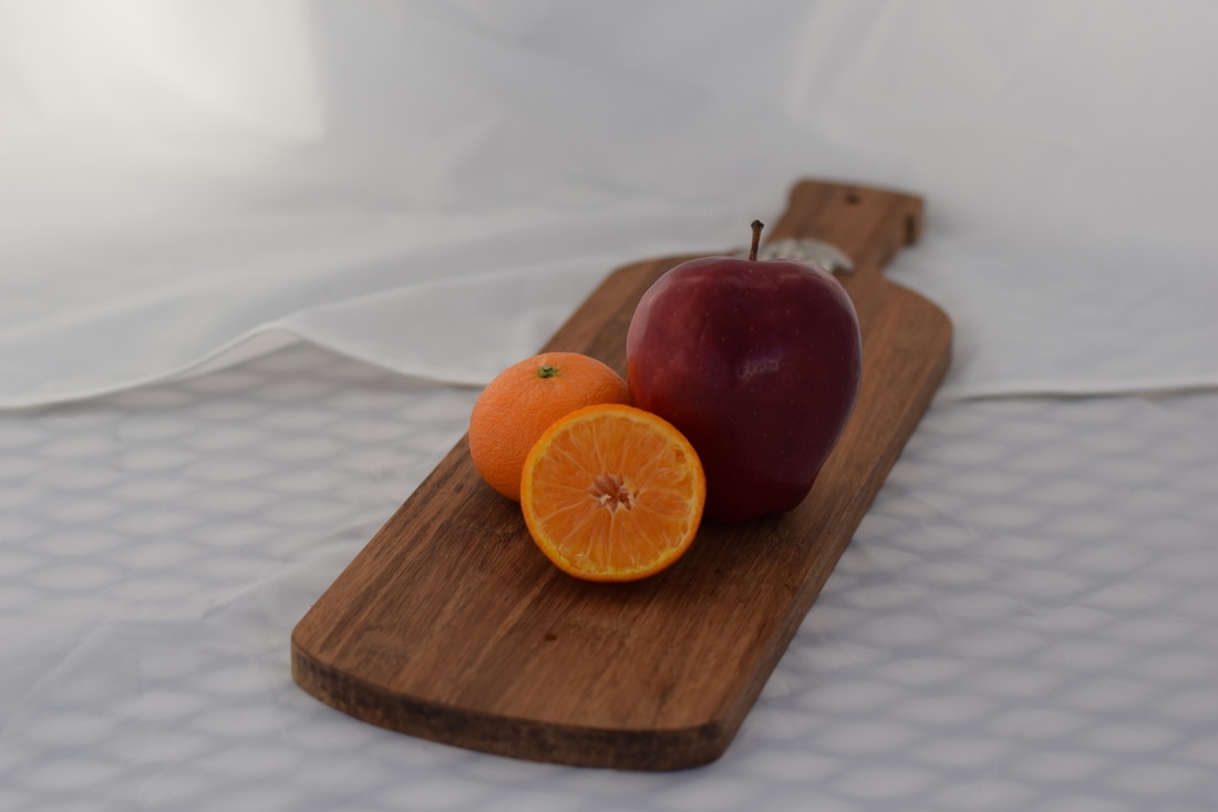
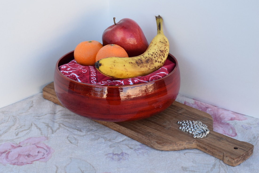
the fruit I brought was an apple, banana and two oranges. As props I had a reddish-brown wooden bowl, towel and bandana. My set up included me stuffing the towel in the bowl so the bandana is visible and can hold the fruit up out of the bowl. I added the board from Mrs. Moncure's supplies to add something to the plain sheet. The backgrounds alternated from a folded sheet of paper to the reflector tent. some things I have learned from this project is that the you really need to keep a steady hand for food photography as well as search for the angles that do and do not work. This type of food photography is mostly done by people working in television and magazines that specialize in culinary topics. Overall I feel mostly successful in the photos I took but would probably not be interested in this type of photography again.
Layer Masks
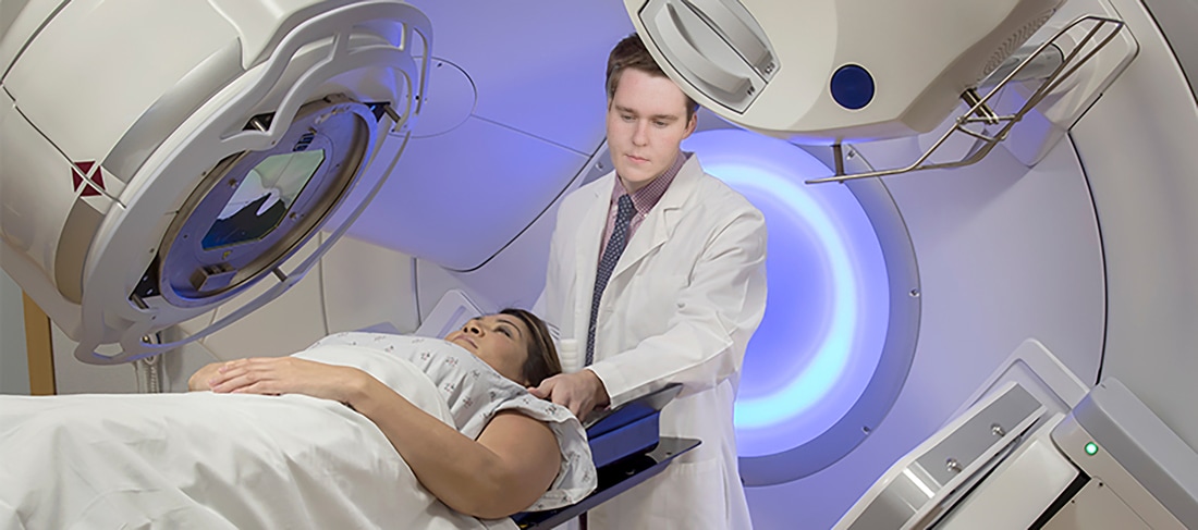
My chosen career is a Radiation Therapist.

This photo is of Leonardo DiCaprio attending the Ellen show.
For my career I chose to be a Radiation Therapist. I chose this career because it is very practical for 70,000+ a year after a simple associates degree. Also, I chose this career to make a difference in people's lives who suffer from terminal illness. I chose a photo of a therapist assisting a woman about to be scanned. I chose a self portrait of myself looking down and added it through a layer process to get the final result. Once my head was placed in the photo I proceeded to adjust the skin tones and blend everything together. My celebrity photo was of Leonardo DiCaprio attending The Ellen Show. I chose this photo because Leo has had major success in many productions and if I was famous I would hope to do the same. Also, I would love to be in The Ellen Show and get to meet her and probably get some free gift. For this photo I did the same process as before (including the adjusting and blending). My face layer was originally to washed out so I had to include further steps of changing the vibrance and saturation as well as blend certain areas around the neck.
Steps:
1. Download celeb and career photo and open them in Photoshop.
2. Once open in Photoshop, select 300 resolution by selecting Image > Image Size.
3. Move the headshot image to the side of the Photoshop workspace by clicking on the title and dragging it to the side.
4. Use the lasso tool to select the head, neck and hair. Using the drag tool, drag it over to the celeb picture
5. Change the OPACITY of the headshot and change it to 60%.
6. Flip the headshot face EDIT> TRANSFORM > FLIP HORIZONTAL. (if needed)
7. Change the scale as needed to make it bigger or smaller by pressing EDIT > TRANSFORM > SCALE.
8. Change the opacity of the top layer back to 100% by going back to the layer thumbnails.
9. Select the MASK tool at the bottom of the layer thumbnails.
10. Use the paintbrush just like an eraser to take away information from the top layer.
11. To make the paintbrush smaller, press the [ button , To make it
larger, press the ] button.
12. You can see where you painted a mask on the second thumbnail for that layer.
13. Switch the color to WHITE and paint over the area you want to show again.
14. Adjust the lightness or contrast to make the skin tones match and the color balance tool to match the color.
15. If there is a clear line between the skin tones, use the BLUR tool on the edges to smooth the layers in.
16. Save it as a Photoshop with all the layers AND a JPEG.
17. Merge the layers by going to LAYERS > MERGE VISIBLE.
18. Save as lastname-firstname-layers-exercise.jpg in your finished projects folder.
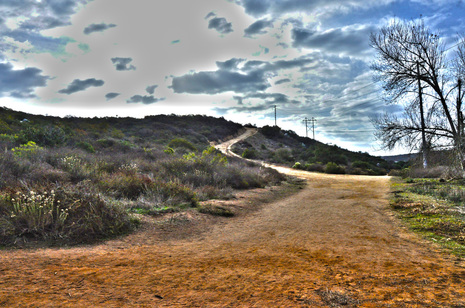
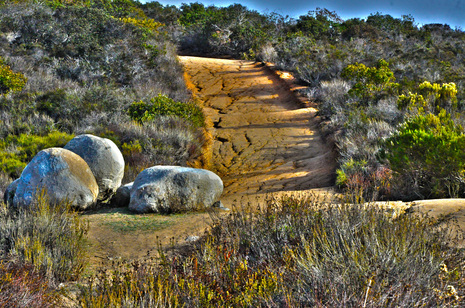
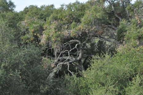
HDR Photography (before & after)
|
|
Frame^ ISO 200, Aperture f/16, Shutter Speed 1/60th
Leading Line^ ISO 200, Aperture f/16, Shutter Speed1/60th
|
|
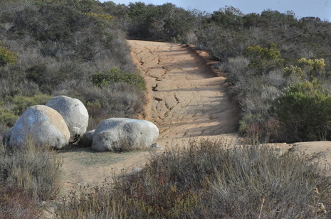
Rule of Thirds^ ISO 200, Aperture f/16, Shutter Speed1/60th
|
|
|
|
Balance^ ISO 200, Aperture f/16, Shutter Speed 1/60th
|
|
Crop^ ISO 200, Aperture f/16, Shutter Speed 1/60th
Photography Artists/Mentors
https://docs.google.com/presentation/d/1HtOzjHsUYYjpVNNa251hOWVkh-NfEhsUwHEOHIkEhtE/edit?usp=sharing
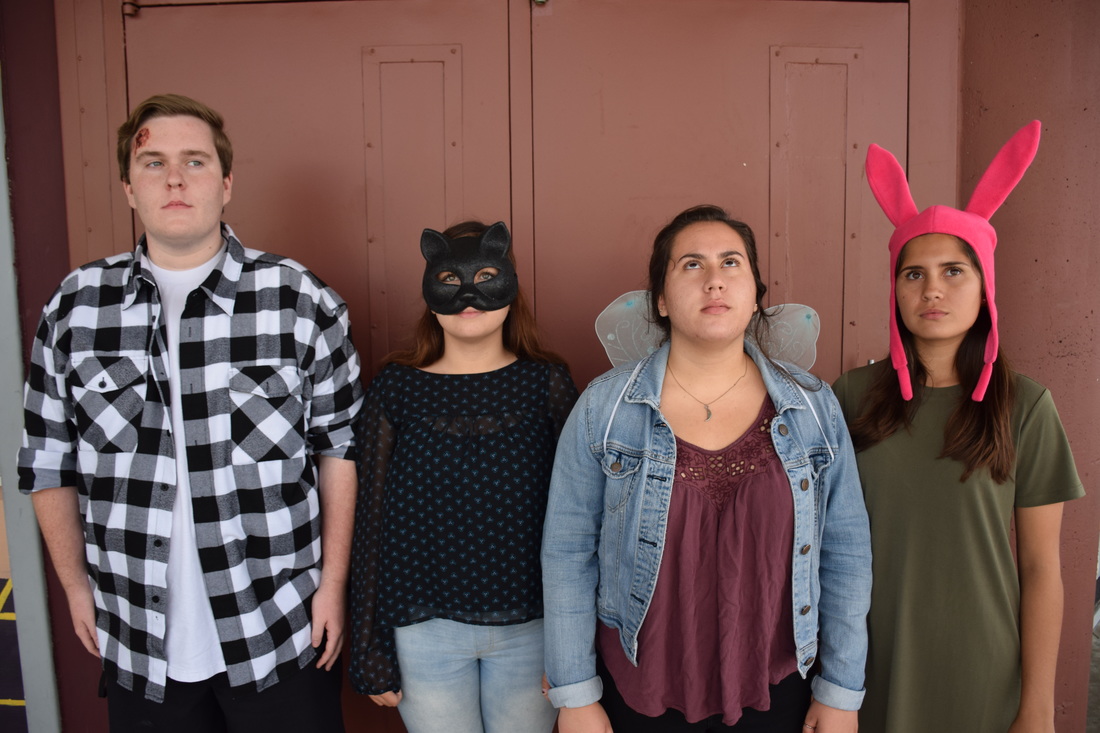
Halloween
In costumes, our class got in groups and took group styled photography. We tried various group positioning and had accessories for the Halloween spirit.
ISO 400, Aperture f/8, Shutter Speed 1/350th
ISO 400, Aperture f/8, Shutter Speed 1/800th
ISO 400, Aperture f/8, Shutter Speed 1/350th
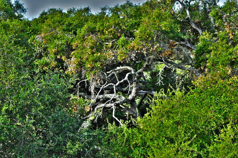
Principles of Art Photos
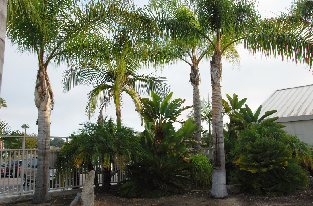
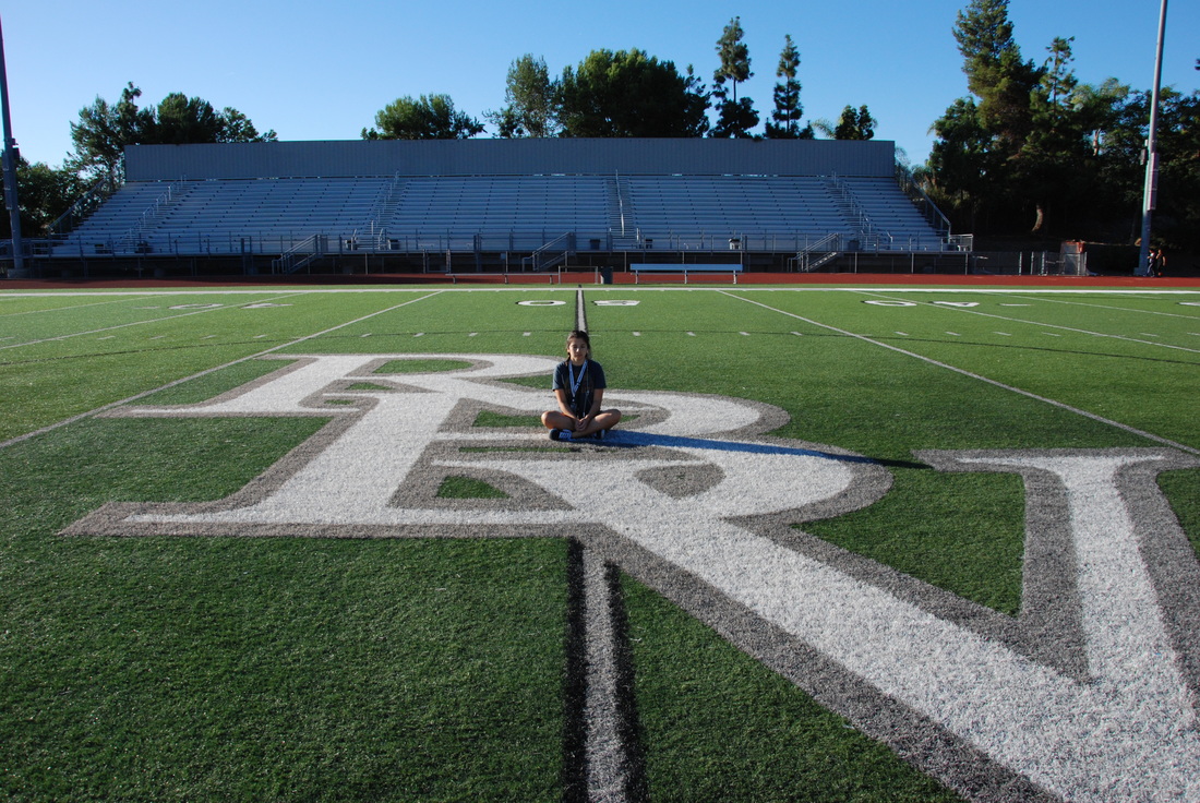
Balance ISO 400, Aperture f/8, Shutter Speed 1/350th
Balance is represented by the two palm trees on opposing sides. They balance out the photo and create equilibrium in the setting.
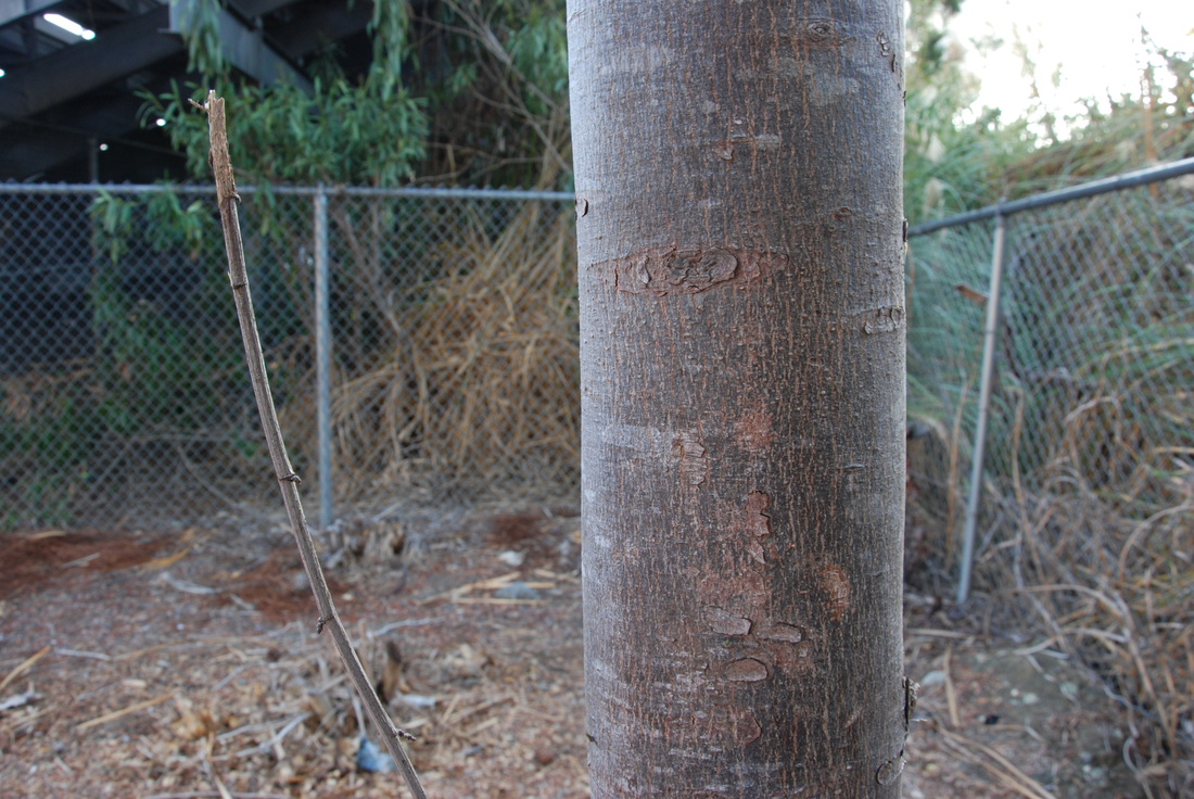
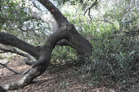
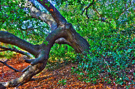
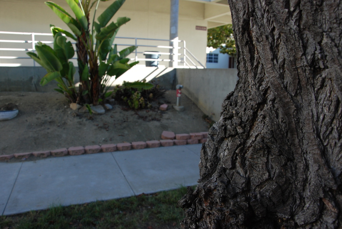
Proportion ISO 400, Aperture f/8, Shutter Speed 1/350th
The twig next to the thick trunk creates the contrast in size. This is proportion because it shows just how thin the twig is in comparison to the thick tree stub. The photo successfully demonstrates the proportion of one subject by its utilization of the other.
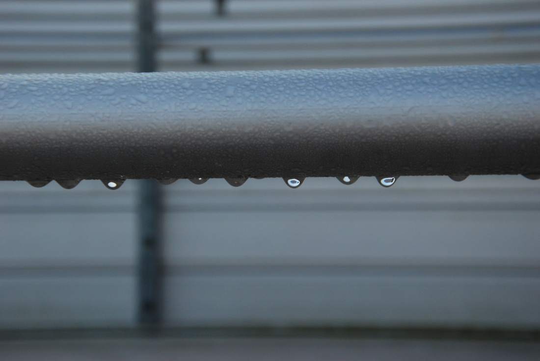
Rhythm ISO 400, Aperture f/8, Shutter Speed 1/350th
Rhythm is shown by the sequence of falling drops. They are all lined up and were dropping one after another. Their action can be anticipated which successfully showcases rhythm's purpose in a photo.
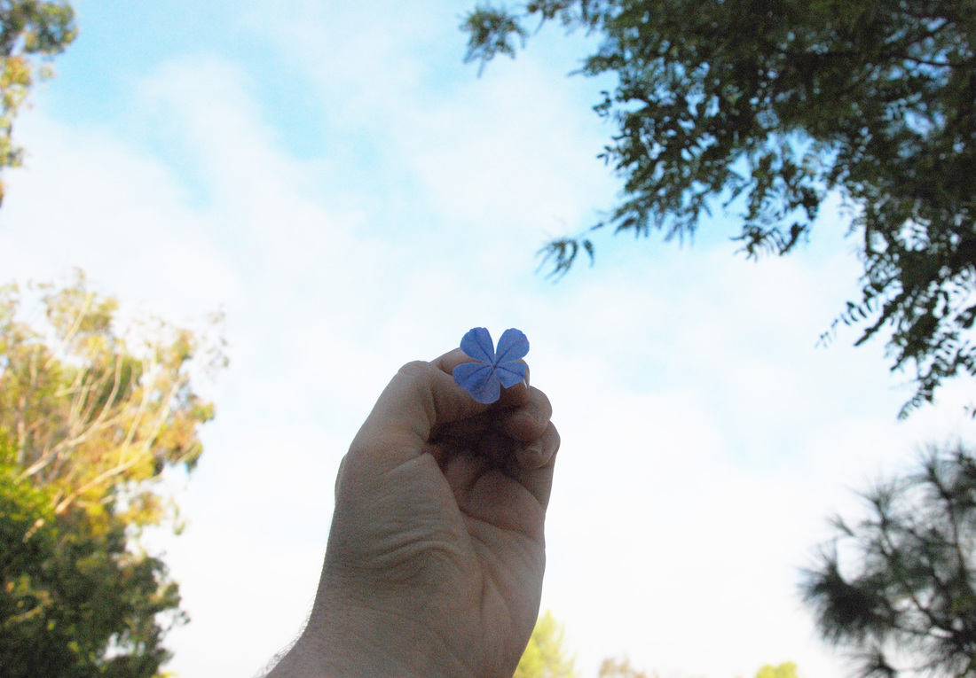
Emphasis ISO 400, Aperture f/8, Shutter Speed 1/350th
The bright white background and earthy colored trees create a contrast to my hand and flower. The main subject of the photo creates direct emphasis while being first examined and seems to draw the attention to the pastel purple flower.
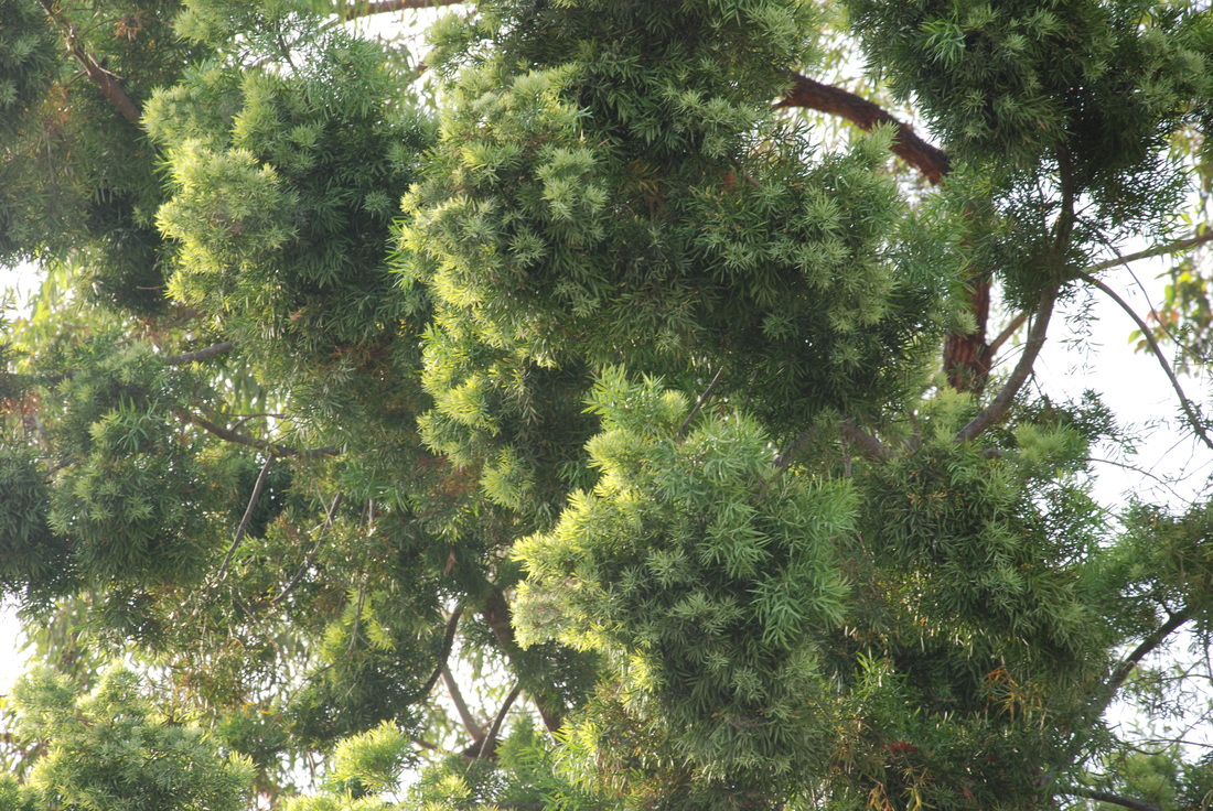
Harmony ISO 400, Aperture f/8, Shutter Speed 1/350th
Harmony is created through the varied shades of green. Lights and shadows create the different colors of the tree's but all blend together in the final result. The back of the tree tops is a white washed sky which compliments the green.
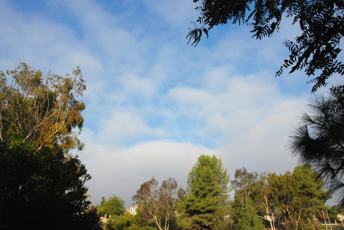
Variety ISO 400, Aperture f/8, Shutter Speed 1/350th
Variety can be seen with the green trees, blue skies, clouds and earthy trunks/branches. This backdrop has the variety of elements that come together to be a landscape-esque photo of the homes beyond RBV'S field.
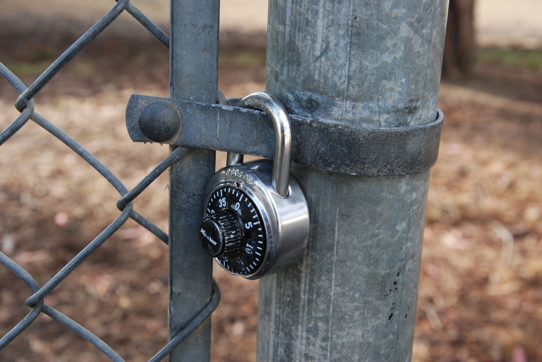
Unity ISO 400, Aperture f/8, Shutter Speed 1/350th
Unity is created by the blending of metals. The fence has a darker gray tone but fits well with the shinier metallic lock. The placement of the lock was almost camouflaged
Elements of Art Photos
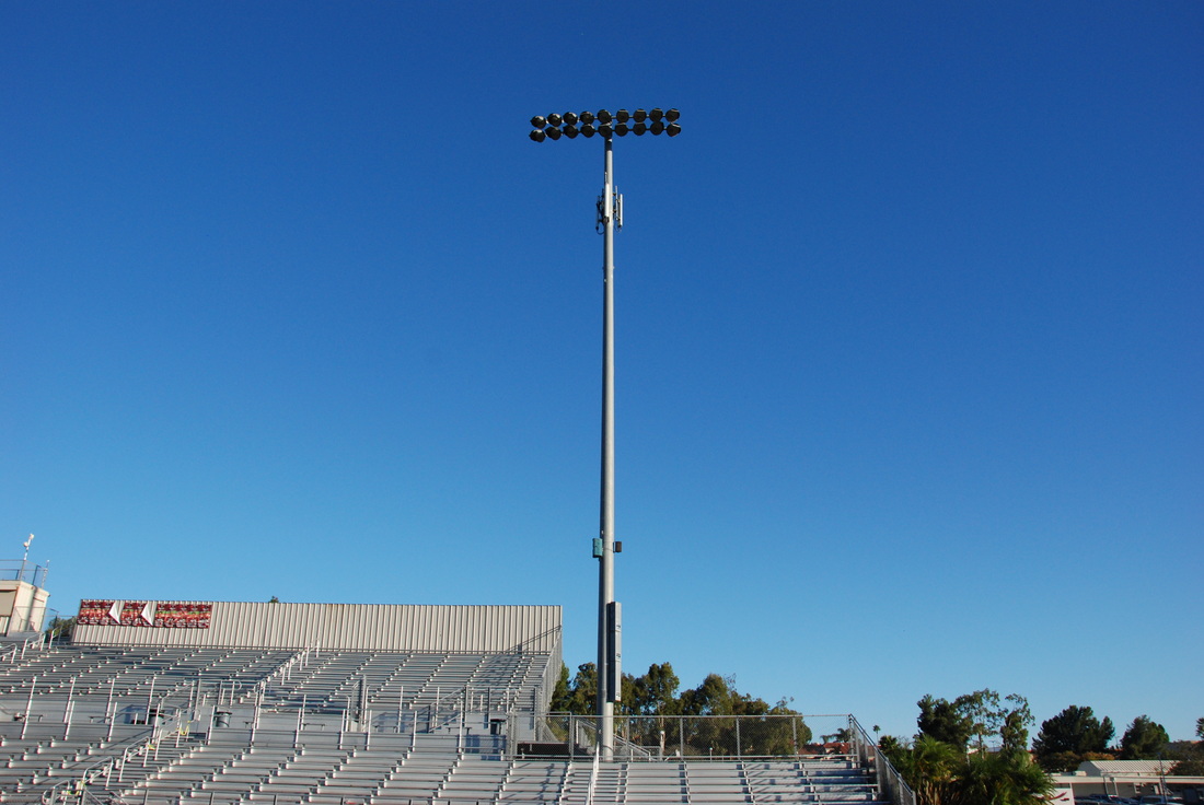
Line ISO 400, Aperture f/8, Shutter Speed 1/350th
This photo is of a long light tower in the bleachers area. The main focus of the photo is the long pole creating a line almost mid center of the photo. The pole directs the eyes along the composition successfully completing lines task in a photo.
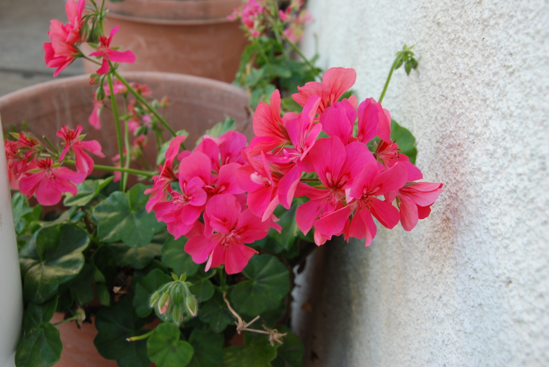
color ISO 400, Aperture f/8, Shutter Speed 1/350th
Color is very vibrant in the pink flowers. The background is very simple and contains neutral colors that contrast the vivid center. There is a pop of the pink color in the middle and match nicely with the green foliage.
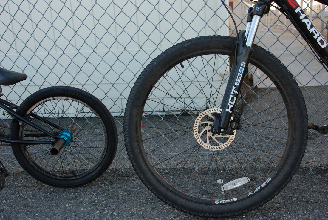
Shape ISO 400, Aperture f/8, Shutter Speed 1/350th
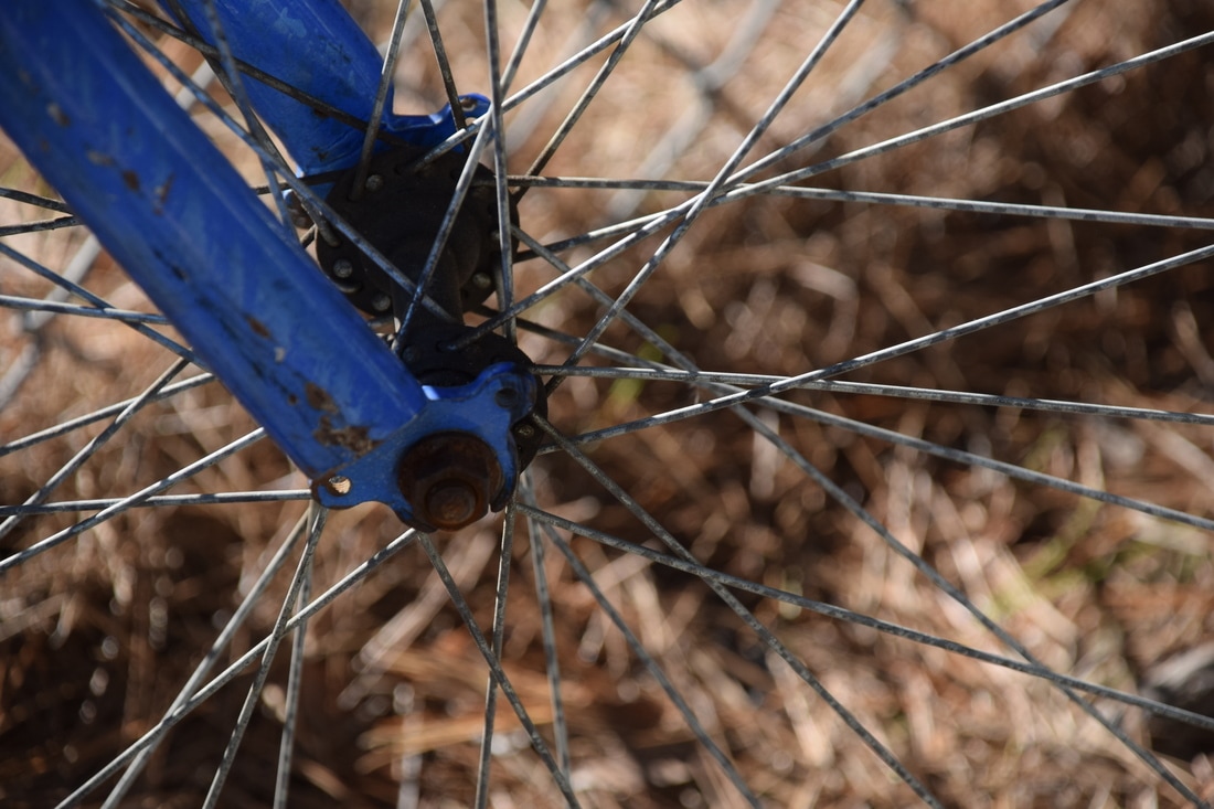
The two bikes are very different in size but have the same circle shape. The shapes are classified as inorganic because they are the creation of man.
Form ISO 400, Aperture f/8, Shutter Speed 1/350th
The setting in the photo creates form. The tree in front creates a 3 dimensional look and showcases the width of the trunk compared to the background. This perspective creates a 3-D setting and creates the contrasting subjects shape.
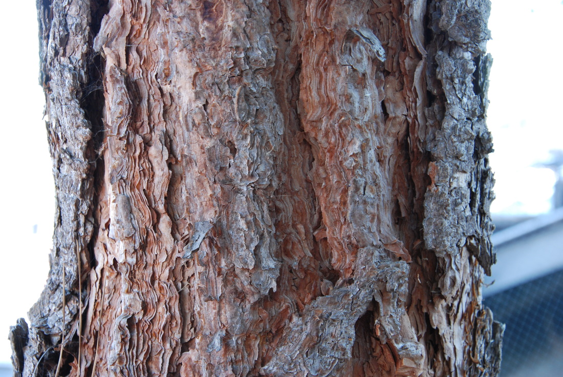
Texture ISO 400, Aperture f/8, Shutter Speed 1/350th
Texture is shown through the bark on the trunk of a tree. The image focuses on the dips and ridges creating the pop in texture. The photo looks slightly like a pastel painting.
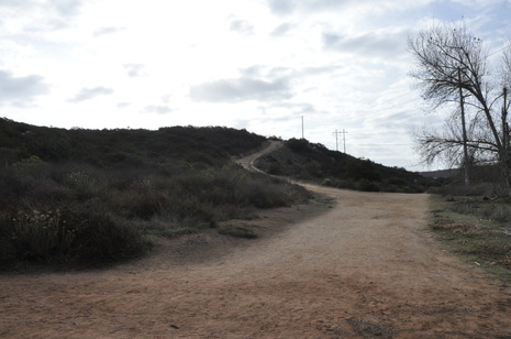
Space ISO 400, Aperture f/8, Shutter Speed 1/350th
Space was created by the vast surroundings of the main focus in the photo. The distance from the center to the back seems very streched and gives a longer perspective in the photo. The subject in the middle successfully creates the space of the background.
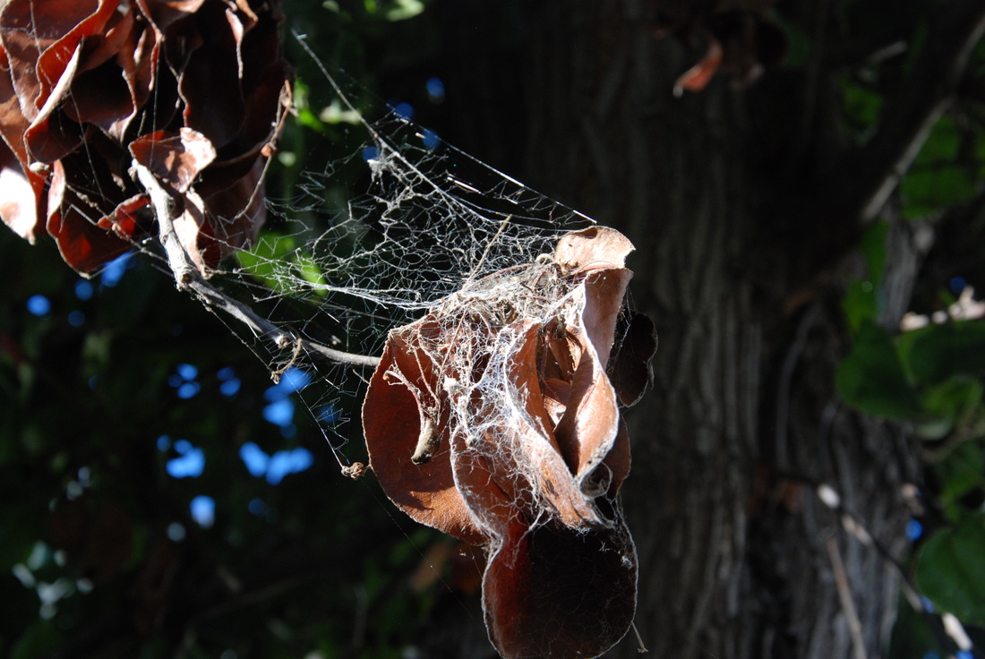
Value ISO 400, Aperture f/8, Shutter Speed 1/350th
Value is shown through shadows and contrasting light created by the web and leaves. The web is bright and reflects light while the shape of the leaves create hollow space for shadows. This successfully incorporates light and shadow to create value.
Elememts/principles of art
Line, color, shape, form, texture, space and value are key to a good design
- Line: one dimensional and can lead the eye in directions. It can vary in width and length
- Line photo: Alfred Steiglitz
- Color: hue (red,yellow,green), value (how dark or light it is), intensity (how bright or dull it is)
- Color photo: Sandy Skoglund
- Shape: two dimensional with height and width
- Shape photo: Laszio Moholy-Nagy
- Form: three dimensional and has height, width, and depth
- Form photo: Ansel Adams
- Texture: surface quality of an object (thick, thin, smooth, ragged
- Texture photo: Kelly Clark
- Space: three dimensional or depth of the space/ use of photos space in background plane
- Space photo: Josef Koudelka
- Value: the lightness or darkness of a surface
- Value photo: Ben Von Wong
- Balance: How opposing forces are used to create stability or equal lay out
- Balance photo: Annie Leibovitz
- Proportion: size and scale (comparison) of various elements in the design
- Proportion photo: Diane Arbus
- Rhythm: movement by repetition or following pattern
- Rhythm photo: Robert Capa
- Emphasis: makes one part of the artwork dominant to other attributes
- Emphasis photo: Steve McCurry
- Harmony: the interacting attributes creating a whole
- Harmony photo: Joel Meyerowitz
- Variety: Clashing or different elements combined
- Variety photo: William Wegman
- Unity: ratio between variety and harmony
- Unity Photo: Mary Ellen Mark
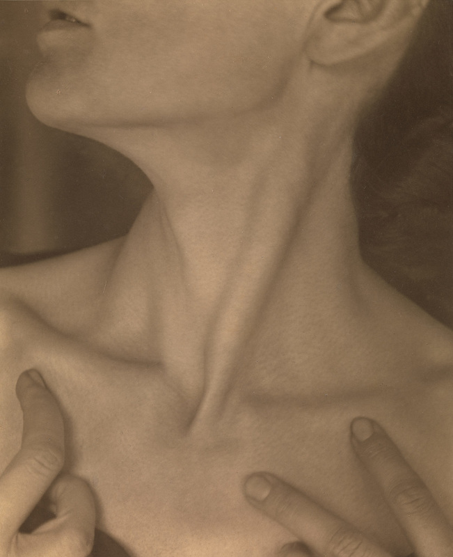
Alfred Steiglitz, 1921
Line is shown in the neck muscle. It directs the eye along the neck and creates emphasis.
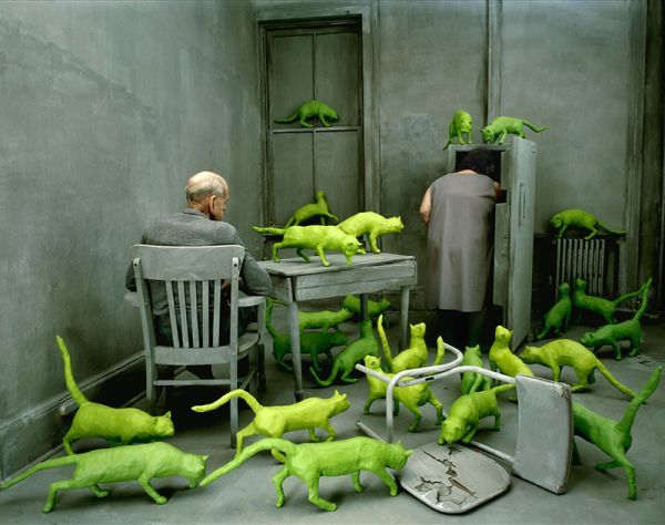
Sandy Skoglund, 1980, Radio Active Cats
Color is used to create the bright neon cats. They contrast the gray background and make them pop out much more.
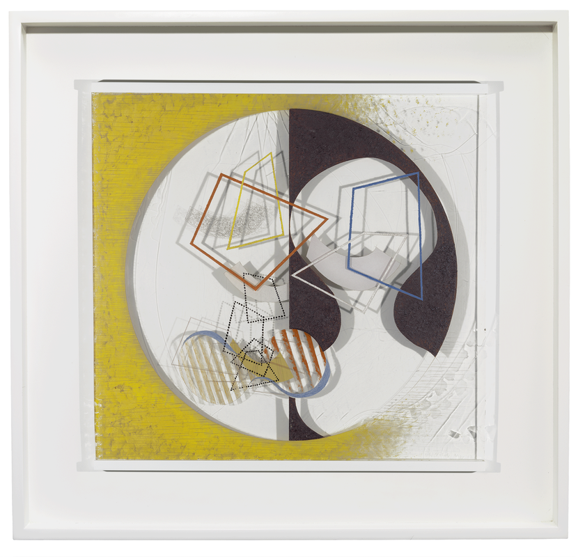
Laszio Moholy-Nagy, 1930-40, The Space Modulator
Shape is used throughout the whole picture. Various shapes are merged together to create a unique design.
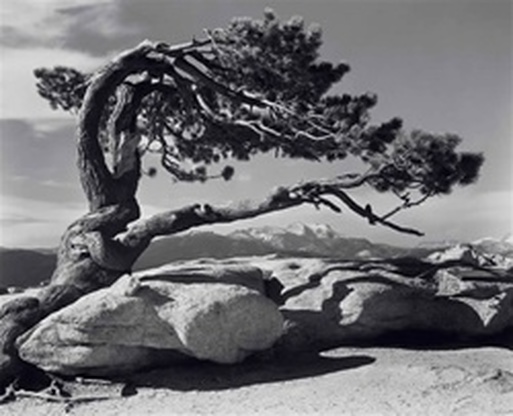
Ansel Adams, 1945, Jeffrey Pine
Form is shown through the trees dimensions. It appears wide and almost 3-dimensional.
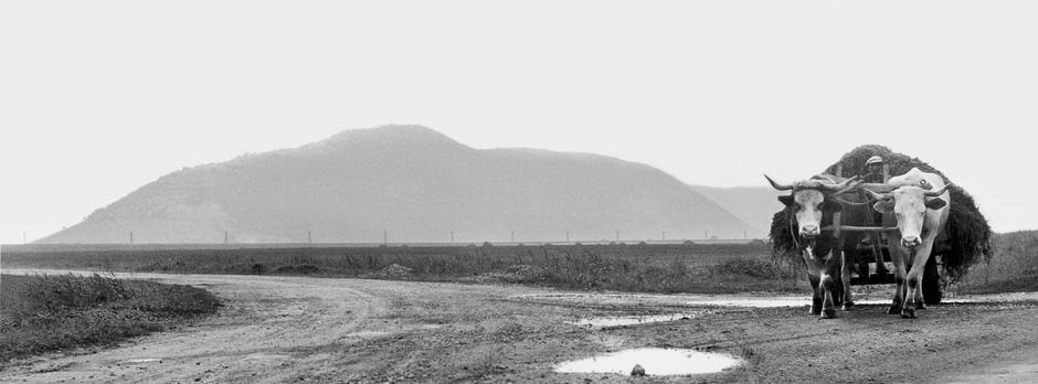
Josef Koudelka, 1958, Stredni Slovensko
Space is used to distance the back of the terrain from the cows. The void is obvious and creates realistic space between subjects.
Ben Von Wong, 2015, Climate Change doesn't care...
Value is used to create the dark and contrasting lightness in the background. It creates vivid quality and heightens the coloring.
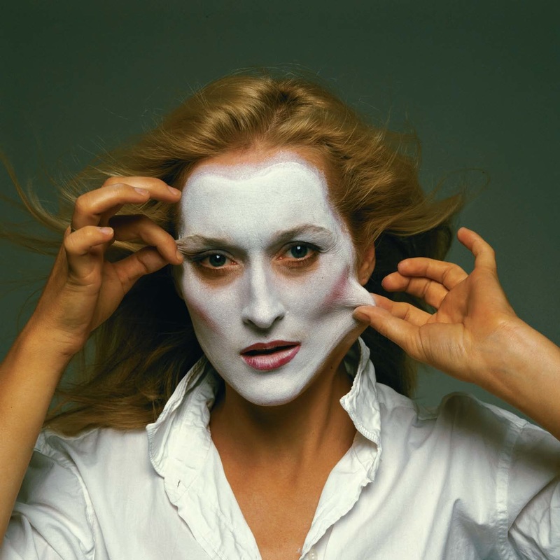
Annie Leibovitz, 1981, Meryl Streep
Balance is used through Meryl's hands. She balances out the pinching of her skin and creates equilibrium throughout the portrait.
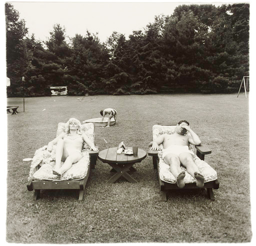
Diane Arbus, 1968, A Family on their Lawn one Sunday in Westchester, NY
Proportion is used to create relationships between the man and woman and the child in back. It showcases the small childs size compared to the adults sunbathing in their back lawn.
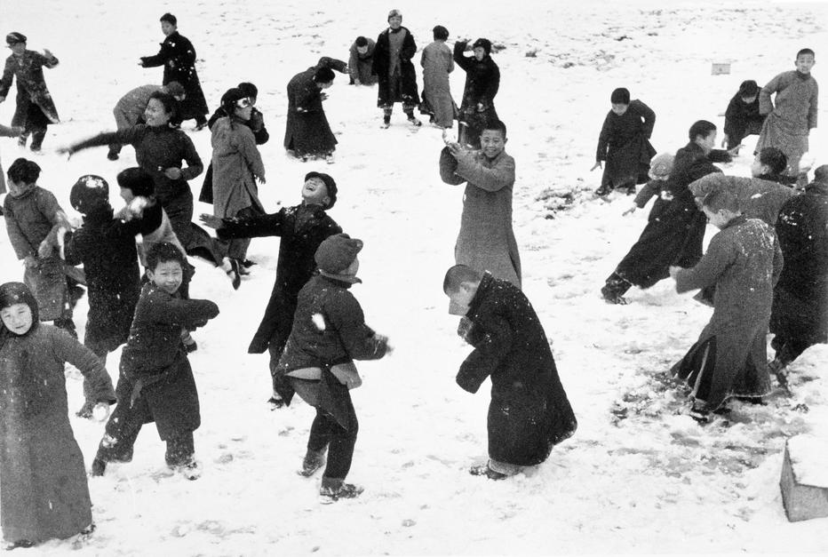
Robert Capa, 1944
Rhythm is shown in the action of the subjects. The mid-action shot brings the motion to a still and captures how the real life snow ball fight was working out.
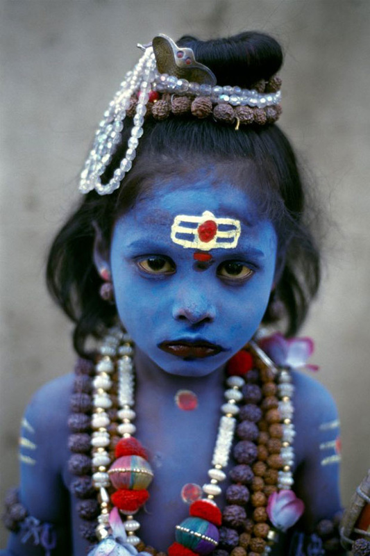
Steve McCurry, 1998, Young Child dressed as Shiva, seeks alms
Emphasis is created on the bright blue makeup. It is a shot of a girl with bright makeup standing against a blurred background. This contrast emphasizes the vivid blue.
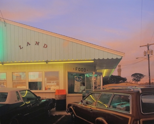
Joel Meyerowitz, 1979, Cape Light
Harmony is shown with the matching shades of each item. The pastels blend well with each other creating harmony throughout the color scheme and setting.
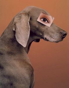
William Wegman, 2001, Eyewear
Variety is the abstracting concepts in the photo. There is a dog and a unusual human eye cut out placed on it.
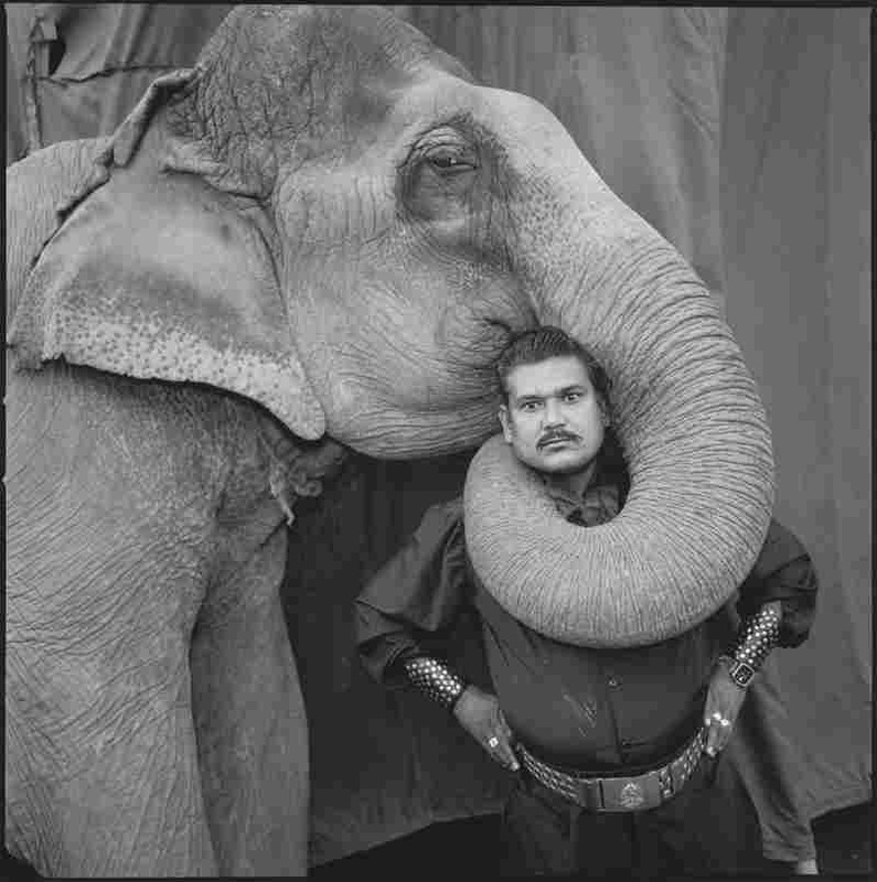
Ram Prakash Singh with his elephant Shyama, Great Golden Circus, 1990
Unity is shown in the matching shades of gray. Also the elephant's trunk wrapping around the man creates unity of the subjects and their similar coloring.
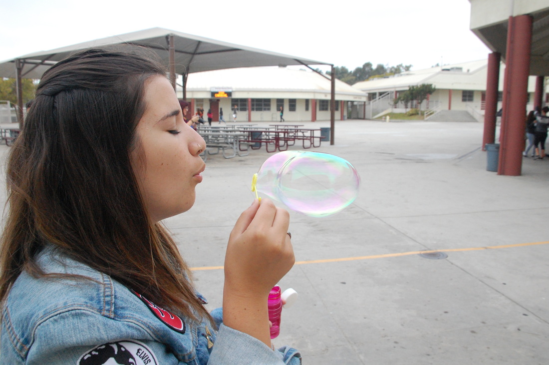
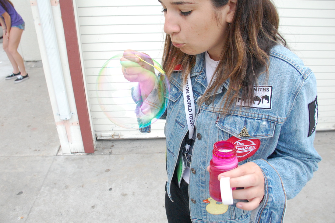
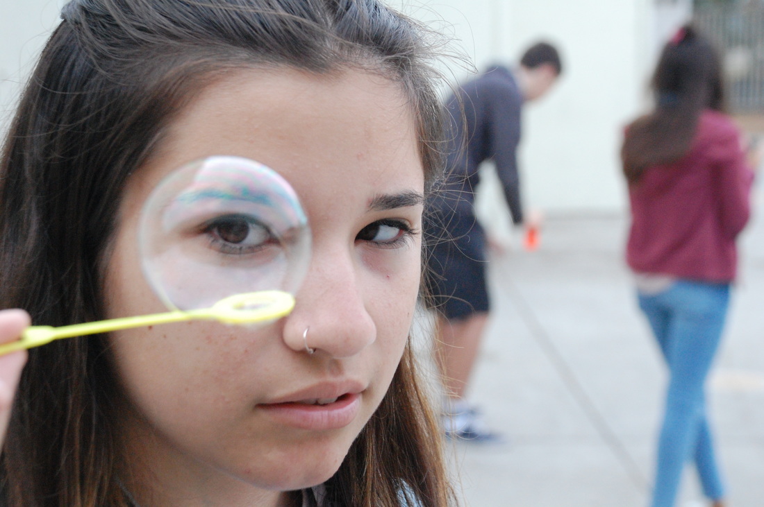
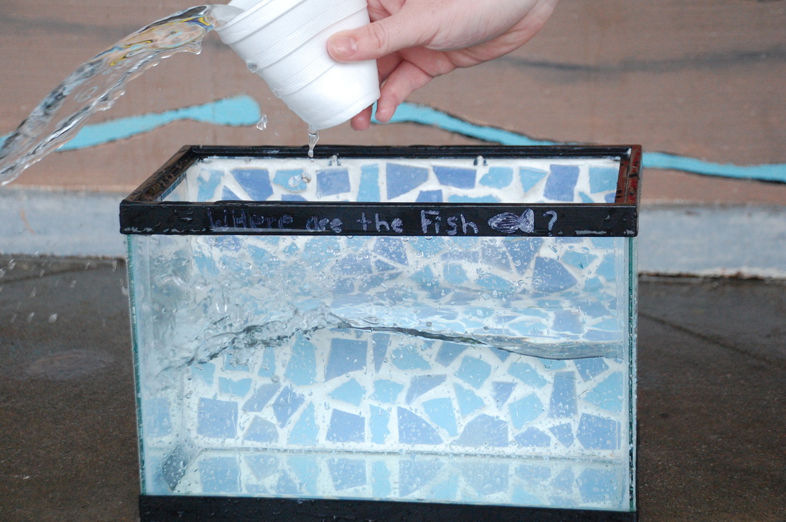
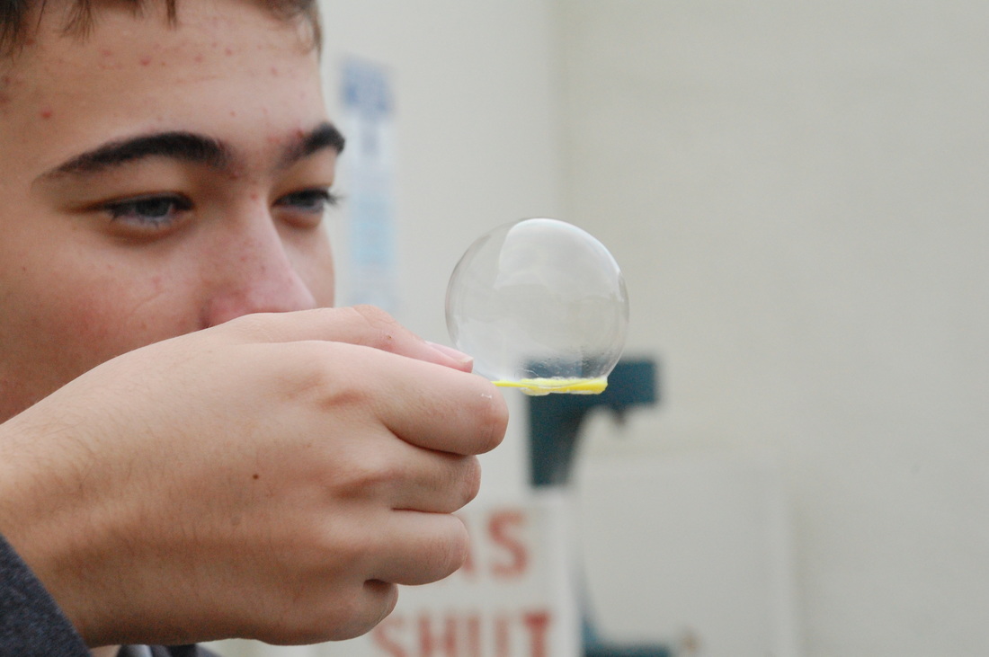
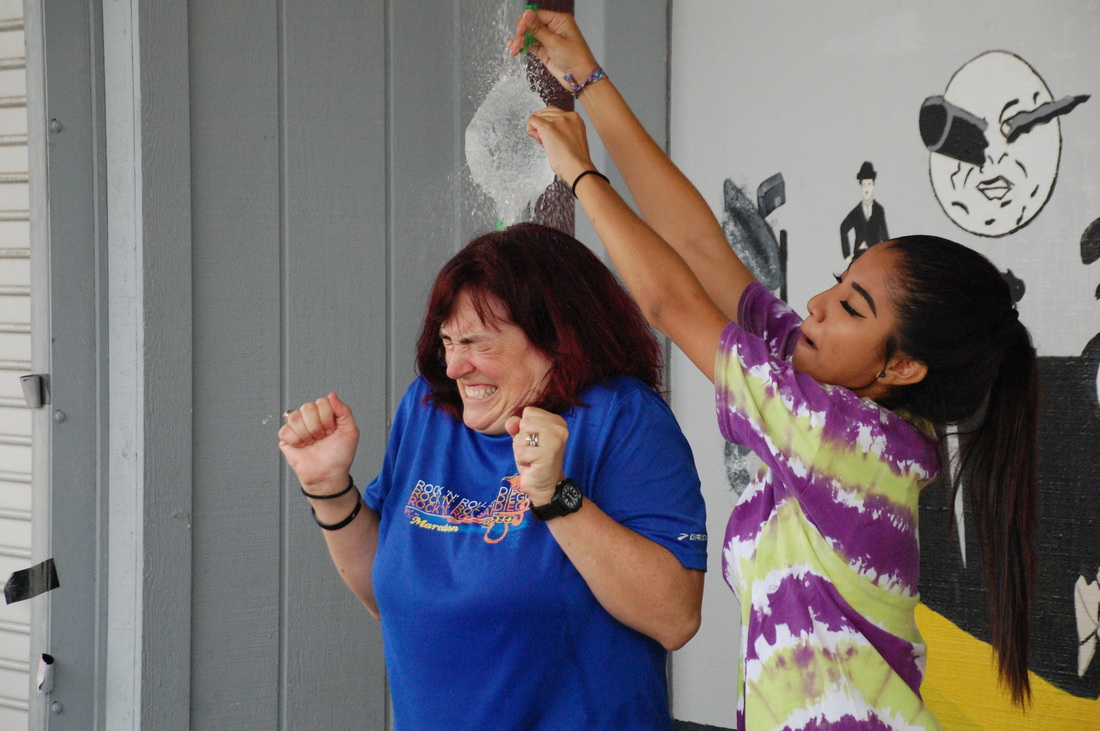
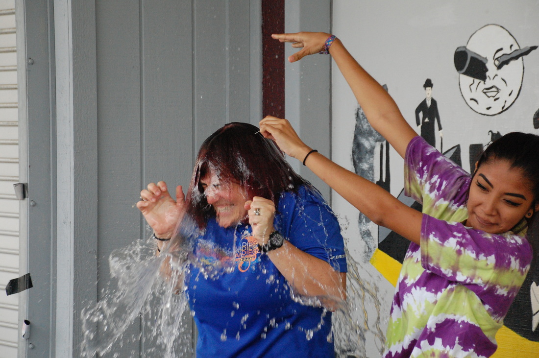
Shutter speed activity
For the shutter speed activity, we did various actions to capture motion in pictures. We blew bubbles, popped water balloons, bounced a tennis ball and flicked cards. Using a 1/1000th shutter speed makes the camera capture photos extremely fast. This was relevant because it was able to freeze the actions while keeping the photo clear and in focus.
aperture f/6.3, shutterspeed 1/1000, ISO 1600
aperture f/6.3, shutterspeed 1/1000, ISO 1600
aperture f/6.3, shutterspeed 1/1000, ISO 1600
aperture f/6.3, shutterspeed 1/1000, ISO 1600
aperture f/6.3, shutterspeed 1/1000, ISO 1600
aperture f/6.3, shutterspeed 1/1000, ISO 1600
aperture f/6.3, shutterspeed 1/1000, ISO 1600
aperture f/6.3, shutterspeed 1/1000, ISO 1600
Light Painting Photos
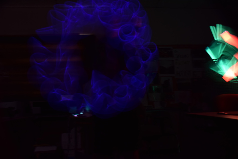
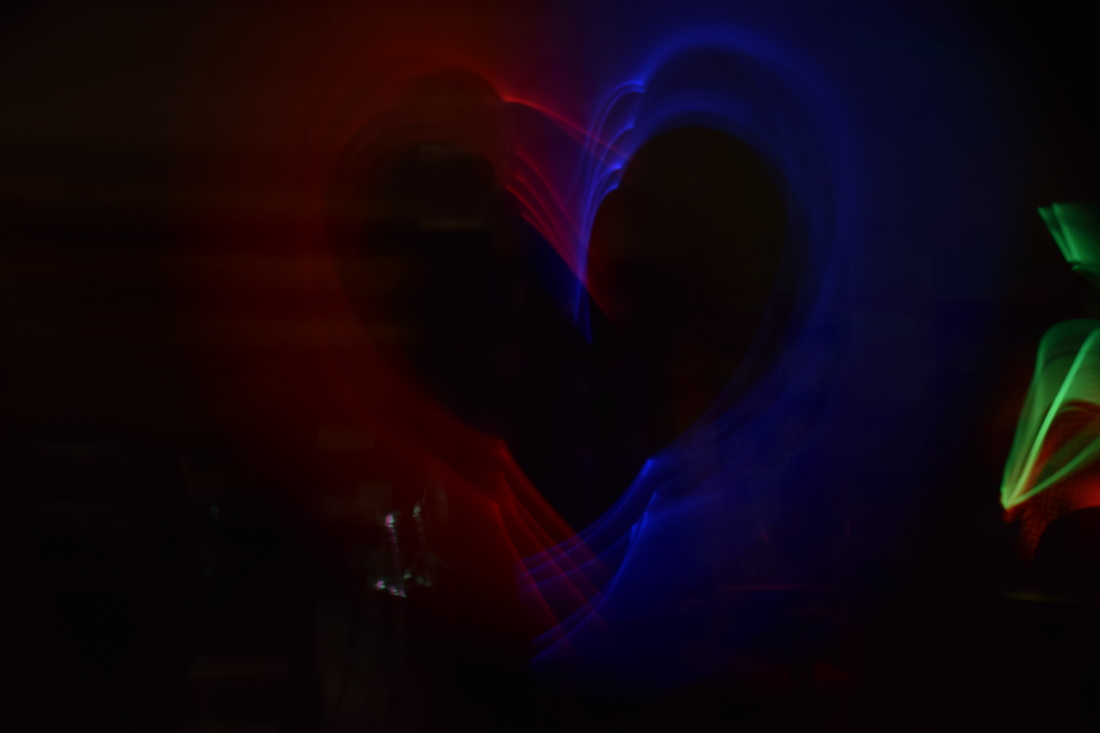
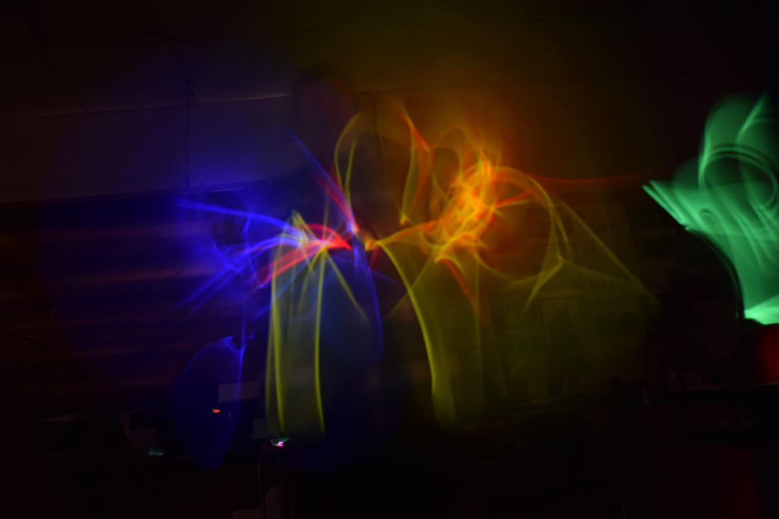
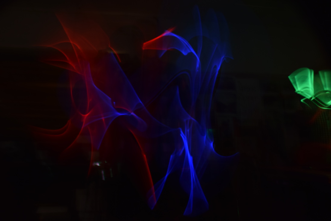
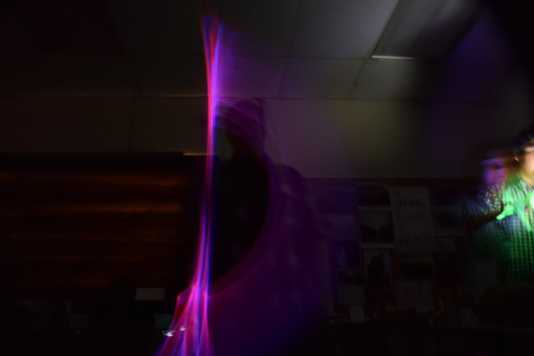
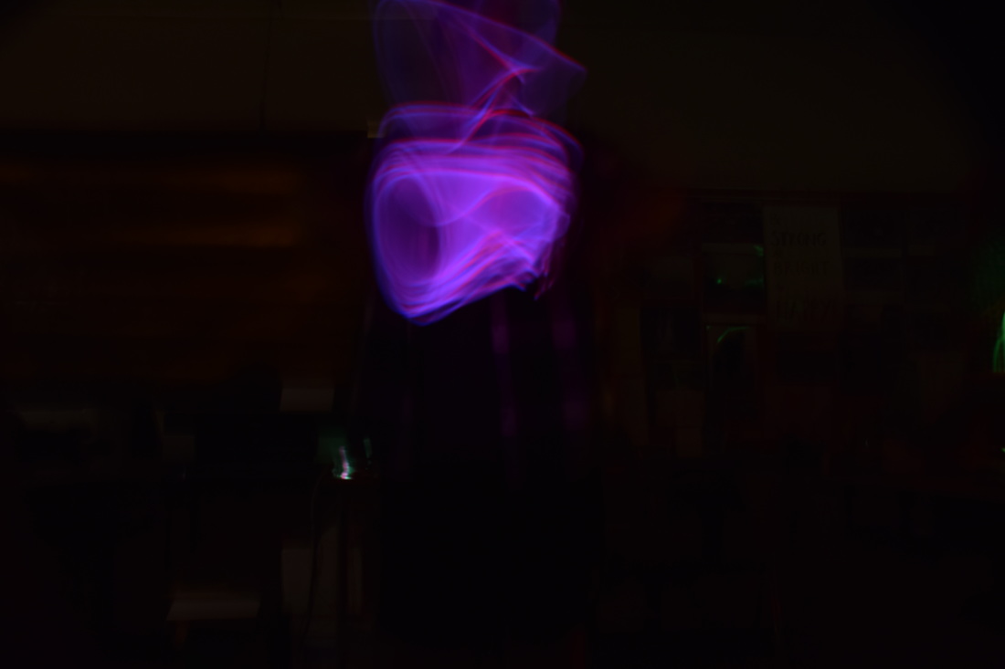
Light Painting photography involves a tripod, dark setting, glowing objects, and a 8 second shutter speed ( along with a f/5.6 aperture and ISO 200). Once the photo is taken, there is a 8 second window to move around the glowing object to create words or shapes. The motion is photographed throughout those seconds and the dark background creates focus solely on the glow. The tripod keeps the camera in perfect stillness that way the photo can remain as clear and focused as possible. For my light painting I used glow sticks and whipped them various directions very fast. I learned that the faster the motion the darker the appearance will be as well as any normal light making it into the backdrop brightens the setting behind the glowing light paint. If I could do this again I would use a phone app so that my glowing lines would be thicker and slightly more visible.
aperture f/5.6, shutter speed 8 seconds, ISO 200
aperture f/5.6, shutter speed 8 seconds, ISO 200
aperture f/5.6, shutter speed 8 seconds, ISO 200
aperture f/5.6, shutter speed 8 seconds, ISO 200
aperture f/5.6, shutter speed 8 seconds, ISO 200
aperture f/5.6, shutter speed 8 seconds, ISO 200
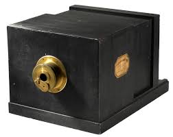
Daguerreotype
|
|
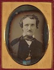
A Daguerreotype is a photograph taken by an early photographic process employing an iodine-sensitized silvered plate and mercury vapor. The astonishingly precise pictures they saw were the work of Louis-Jacques-Mandé Daguerre (1787–1851), a
Romantic painter and printmaker most famous until then as the proprietor of the Diorama, a popular Parisian spectacle featuring theatrical painting and lighting effects. Each daguerreotype (as Daguerre dubbed his invention) was a one-of-a-kind image on a highly polished, silver-plated sheet of copper.
Romantic painter and printmaker most famous until then as the proprietor of the Diorama, a popular Parisian spectacle featuring theatrical painting and lighting effects. Each daguerreotype (as Daguerre dubbed his invention) was a one-of-a-kind image on a highly polished, silver-plated sheet of copper.
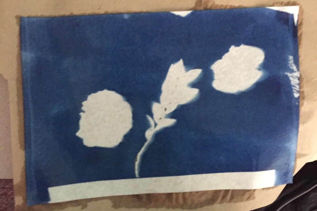
Cyanotype
|
|
A cyanotype is a photographic blue print. The process to create one includes:
The cyanotype made up of two simple solutions.
The cyanotype made up of two simple solutions.
- Potassium ferricyanide and Ferric ammonium citrate (green) are mixed with water separately.
- The two solutions are then blended together in equal parts.
- Paper, card, textiles or any other naturally absorbent material is coated with the solution and dried in the dark.
- Objects or negatives are placed on the material to make a print. The cyanotype is printed using UV light, such as the sun, a light box or a UV lamp.
- After exposure the material is processed by simply rinsing it in water. A white print emerges on a blue background.
- The final print is dried and admired.
Shutter Speed
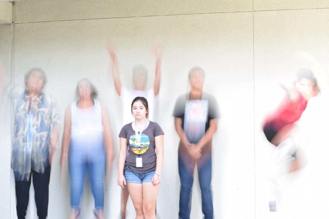
aperture f/16 , shutter speed 1/3 , ISO 100
This photo was taken with the 1/3 shutter speed. I had the cameras switch pointing to 'S' which meant it was shutter priority. This low speed creates a motion within the picture and made the picture very bright. This shutter speed is best used when you want to capture the blur of motion of whatever may be moving around.
aperture f/11 , shutter speed 1/30 , ISO 100
To get to the shutter speed of 1/30 I had to move the switch at the top right corner of the camera until the screen read '1/30th". This seemed similar to the 1/3rd speed but the brightness was lowered and those who were no moving were completely clear. This shutter speed can show motion as well as keep some element visible and solid.
aperture f/9 , shutter speed 1/60 , ISO 100
I switched the camera at the same top right corner until the screen read '1/60th'. The picture quality was similar to the previous shutter speed but those in motion are becoming more solid. The part of the subject moving displays motion but the more stable parts are clear and stationed. The shutter speed of 1/60 is around the time the pictures will appear more frozen in shot.
aperture f/4, shutter speed 1/250 , ISO 100
I switched the top right tab until the screen read '1/250th'. This shutter speed can completely freeze a subject in mid motion and maintain a clear quality. The speed of the clicker was very fast and didn't seem to be any longer than an automatic setting click. This shutter speed is best for capturing fast motion shots where you want a clear and clean immobile photo.
aperture f/1.8 , shutter speed 1/1000 , ISO 100
The final shutter speed switch was the 1/1000th option on the screen. This caught the photo of everyone moving and balanced a clear quality throughout. The speed of the shot was very fast and would be best utilized in situations of cars racing or fast paced events. This shutter speed produced the best quality photo and can fully freeze fast motion subjects.
Camera Obscura
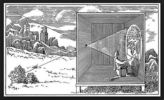
Camera obscura is a form of reflection. It is done when a dark room or enclosed area has a small hole of light peep through. This creates an upside down reflection of the outside world on the nearest wall(s). As for todays use, it has been modified with additions of extra lenses and box structures to create the reflection In a more controlled way for sketching or photography. This concept can be recreated by simply making a room completely dark and allowing light to enter through a small hole placed over a covered window/light. This artistic fad has been utilized since the medieval times due to its simplicity and convenience.
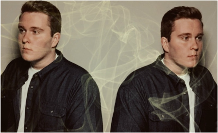
Surreal Selfie
For my photos background, I chose a simple white backdrop(my bedroom closet door). I chose this background because I enjoy minimalist aesthetics and colors (such as black,white, and gray). I also chose this location because my own bedroom is where I feel most comfortable and at peace. I decided to use a peachy edit to symbolize my youth and fresh outlook at the world. I am a very positive person and tried to emulate that through the slightly grainy pastel edit.
I used a mirroring edit on my phones photo editing options to portray my multiple perspectives in life. I like to place myself in other ways of thinking to widen my point of view and see things in a way I might not always be used to. I placed my eyes in different directions to demonstrate my constant conflicting choices (such as career paths) I often ponder about. I also wanted to convey my open mindedness to various opinions others strongly believe in because we all hold ethics we believe to be important and it's always good to accept others thoughts.
The last step in my editing process included the adding of the smoke to the backdrop. I chose smoke to symbolize my creativity that constantly flows around me. I draw inspiration for artistic outlets in little details all around me and try to broaden my ideas on what looks artsy or pleasing to the eye. The smoke is slightly tinted green because that is my favorite color and complimented the eggshell white background. Putting all these edits together exhibit my inner thought process when it comes to basic life values and ambitious outlooks in my hopefully exciting life.
|
